Medium uses browser cookies to give you the best possible experience. To make Medium work, we log user data and share it with processors. To use Medium, you must agree to our Privacy Policy, including cookie policy. Become a member Homepage Go to the profile of Dr. Gregor Scheithauer Dr. Gregor Scheithauer I help companies to improve their business processes using data science. - All Words are my own www.gregorscheithauer.de May 14 Data visualization in Python like in R’s ggplot2
If you love plotting your data with R’s ggplot2 but you are bound to use Python, the plotnine package is worth to look into as an alternative to matplotlib.
In this post I show you how to get started with plotnine for productive output.
If you want to follow along please find the whole script on GitHub: scheithauer/python-plotnine
python-plotnine - Data visualization in Python like in R's ggplot2 github.com ggplot2
ggplot2 is a system for declaratively creating graphics, based on The Grammar of Graphics. You provide the data, tell ggplot2 how to map variables to aesthetics, what graphical primitives to use, and it takes care of the details. Source: http://ggplot2.tidyverse.org/
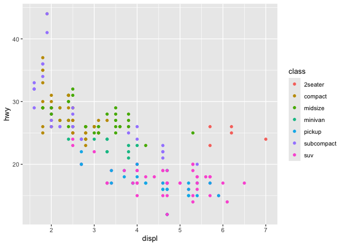
ggplot output; http://ggplot2.tidyverse.org/reference/figures/README-example-1.png plotnine as an alternative to python’s matplotlib
In my experience the advantage of ggplot2 is the implementation of the grammar of graphics.
plotnine is a Grammar of Graphics for Python by Hassan Kibirige and brings the same advantages to python: Less coding and easy understanding (declarative paradigm). Setup Installing plotnine
$ pip install plotnine # 1. should be sufficient for most $ pip install 'plotnine[all]' # 2. includes extra/optional packages
$ conda install -c conda-forge plotnine
Data for visualizations
I used the craft-beers-dataset from Jean-Nicholas Hould. It contains information about 2,410 US craft beers. The information includes:
abv — The alcoholic content by volume with 0 being no alcohol and 1 being pure alcohol
ibu — International bittering units, which describe how bitter a drink is.
name — Name of the beer.
style — Beer style (lager, ale, IPA, etc.)
brewery_id — Unique identifier for brewery that produces this beer
ounces — Size of beer in ounces.
Data set example entries Install necessary libs
import pandas as pd import numpy as np from plotnine import *
Define useful constants
c_remote_data ='https://raw.githubusercontent.com/nickhould/craft-beers-dataset/master/data/processed/beers.csv' c_col = ["#2f4858", "#f6ae2d", "#f26419", "#33658a", "#55dde0", "#2f4858", "#2f4858", "#f6ae2d", "#f26419", "#33658a", "#55dde0", "#2f4858"]
Useful functions
def labels(from_, to_, step_): return pd.Series(np.arange(from_, to_ + step_, step_)).apply(lambda x: '{:,}'.format(x)).tolist()
def breaks(from_, to_, step_): return pd.Series(np.arange(from_, to_ + step_, step_)).tolist()
Read data and set index
data = pd.read_csv(c_remote_data)
data = ( data.filter([ 'abv', 'ibu', 'id', 'name', 'style', 'brewery_id', 'ounces' ]). set_index('id') )
Histogram Initial
fig = ( ggplot(data.dropna(subset = ['abv'])) + geom_histogram(aes(x = 'abv')) )
Adding color
fig = ( ggplot(data.dropna(subset = ['abv'])) + geom_histogram( aes(x = 'abv'), fill = c_col[0], color = 'black' ) )
Adding labels
fig = ( ggplot(data.dropna(subset = ['abv'])) + geom_histogram( aes(x = 'abv'), fill = c_col[0], color = 'black' ) + labs( title ='Distribution of The alcoholic content by volume (abv)', x = 'abv - The alcoholic content by volume', y = 'Count', ) )
Set the axes scaling
fig = ( ggplot(data.dropna(subset = ['abv'])) + geom_histogram( aes(x = 'abv'), fill = c_col[0], color = 'black' ) + labs( title ='Distribution of The alcoholic content by volume (abv)', x = 'abv - The alcoholic content by volume', y = 'Count', ) + scale_x_continuous( limits = (0, 0.14), labels = labels(0, 0.14, 0.02), breaks = breaks(0, 0.14, 0.02) ) + scale_y_continuous( limits = (0, 350), labels = labels(0, 350, 50), breaks = breaks(0, 350, 50) ) )
Apply one of the available themes
theme_set( theme_538() ) # one time call
Change some theme features
theme_set( theme_538() + theme( figure_size = (8, 4), text = element_text( size = 8, color = 'black', family = 'Arial' ), plot_title = element_text( color = 'black', family = 'Arial', weight = 'bold', size = 12 ), axis_title = element_text( color = 'black', family = 'Arial', weight = 'bold', size = 6 ), ) )
Add some statistics
fig = ( ggplot(data.dropna(subset = ['abv'])) + geom_histogram( aes(x = 'abv'), fill = c_col[0], color = 'black' ) + labs( title ='Distribution of The alcoholic content by volume (abv)', x = 'abv - The alcoholic content by volume (median = dashed line; mean = solid line)', y = 'Count', ) + scale_x_continuous( limits = (0, 0.14), labels = labels(0, 0.14, 0.02), breaks = breaks(0, 0.14, 0.02) ) + scale_y_continuous( limits = (0, 350), labels = labels(0, 350, 50), breaks = breaks(0, 350, 50) ) + geom_vline(aes(xintercept = data.abv.mean()), color = 'gray') + geom_vline(aes(xintercept = data.abv.median()), linetype = 'dashed', color = 'gray') )
Faceting
fig = ( ggplot(data.dropna(subset = ['abv', 'style'])[data['style'].dropna().str.contains('American')]) + geom_histogram( aes(x = 'abv'), fill = c_col[0], color = 'black' ) + labs( title ='Distribution of The alcoholic content by volume (abv)', x = 'abv - The alcoholic content by volume', y = 'Count', ) + scale_x_continuous( limits = (0, 0.14), labels = labels(0, 0.14, 0.07), breaks = breaks(0, 0.14, 0.07) ) + scale_y_continuous( limits = (0, 300), labels = labels(0, 300, 100), breaks = breaks(0, 300, 100) ) + theme(figure_size = (8, 12)) + facet_wrap('~style', ncol = 4) )
Scatterplots Initial
fig = ( ggplot(data.dropna(subset = ['abv'])) + geom_point( aes(x = 'abv', y = 'ibu'), fill = c_col[0], color = 'black' ) + labs( title ='Relationship between alcoholic content (abv) and int. bittering untis (ibu)', x = 'abv - The alcoholic content by volume', y = 'ibu - International bittering units', ) + scale_x_continuous( limits = (0, 0.14), labels = labels(0, 0.14, 0.02), breaks = breaks(0, 0.14, 0.02) ) + scale_y_continuous( limits = (0, 150), labels = labels(0, 150, 30), breaks = breaks(0, 150, 30) ) )
Changing point sizes to a variable
fig = ( ggplot(data.dropna(subset = ['abv'])) + geom_point( aes(x = 'abv', y = 'ibu', size = 'ounces'), fill = c_col[0], color = 'black' ) + labs( title ='Relationship between alcoholic content (abv) and int. bittering untis (ibu)', x = 'abv - The alcoholic content by volume', y = 'ibu - International bittering units', ) + scale_x_continuous( limits = (0, 0.14), labels = labels(0, 0.14, 0.02), breaks = breaks(0, 0.14, 0.02) ) + scale_y_continuous( limits = (0, 150), labels = labels(0, 150, 30), breaks = breaks(0, 150, 30) ) )
Changing point color to a variable
data['ounces_str'] = data['ounces'] data['ounces_str'] = data['ounces_str'].apply(str)
fig = ( ggplot(data.dropna(subset = ['abv'])) + geom_point( aes(x = 'abv', y = 'ibu', fill = 'ounces_str'), alpha = 0.5, color = 'black' ) + labs( title ='Relationship between alcoholic content (abv) and int. bittering untis (ibu)', x = 'abv - The alcoholic content by volume', y = 'ibu - International bittering units', ) + scale_fill_manual( name = 'Ounces', values = c_col) + scale_x_continuous( limits = (0, 0.14), labels = labels(0, 0.14, 0.02), breaks = breaks(0, 0.14, 0.02) ) + scale_y_continuous( limits = (0, 150), labels = labels(0, 150, 30), breaks = breaks(0, 150, 30) ) )
Adding a linear regression line
fig = ( ggplot(data.dropna(subset = ['abv'])) + geom_point( aes(x = 'abv', y = 'ibu', fill = 'ounces_str'), alpha = 0.5, color = 'black' ) + geom_smooth( aes(x = 'abv', y = 'ibu') ) + labs( title ='Relationship between alcoholic content (abv) and int. bittering untis (ibu)', x = 'abv - The alcoholic content by volume', y = 'ibu - International bittering units', ) + scale_fill_manual( name = 'Ounces', values = c_col) + scale_x_continuous( limits = (0, 0.14), labels = labels(0, 0.14, 0.02), breaks = breaks(0, 0.14, 0.02) ) + scale_y_continuous( limits = (0, 150), labels = labels(0, 150, 30), breaks = breaks(0, 150, 30) ) )
Faceting
fig = ( ggplot(data.dropna(subset = ['abv'])) + geom_jitter( aes(x = 'abv', y = 'ibu', fill = 'ounces_str'), width = 0.0051, height = 5, color = 'black' ) + labs( title ='Relationship between alcoholic content (abv) and int. bittering untis (ibu)', x = 'abv - The alcoholic content by volume', y = 'ibu - International bittering units', ) + scale_fill_manual( guide = False, name = 'Ounces', values = c_col) + scale_x_continuous( limits = (0, 0.14), labels = labels(0, 0.14, 0.02), breaks = breaks(0, 0.14, 0.02) ) + scale_y_continuous( limits = (0, 150), labels = labels(0, 150, 30), breaks = breaks(0, 150, 30) ) + facet_wrap('ounces_str') )
Heatmap
fig = ( ggplot(data.dropna(subset = ['abv'])) + geom_bin2d( aes(x = 'abv', y = 'ibu') ) + labs( title ='Relationship between alcoholic content (abv) and int. bittering untis (ibu)', x = 'abv - The alcoholic content by volume', y = 'ibu - International bittering units', ) + scale_x_continuous( limits = (0, 0.14), labels = labels(0, 0.14, 0.02), breaks = breaks(0, 0.14, 0.02) ) + scale_y_continuous( limits = (0, 150), labels = labels(0, 150, 30), breaks = breaks(0, 150, 30) ) + theme(figure_size = (8, 8)) )
Boxplot Generix boxplot
fig = ( ggplot(data.dropna(subset = ['abv'])) + geom_boxplot( aes(x = 'ounces_str', y = 'abv') ) + labs( title ='Distribution of alcoholic content (abv) by size', x = 'size in ounces', y = 'abv - The alcoholic content by volume', ) + scale_y_continuous( limits = (0, 0.14), labels = labels(0, 0.14, 0.02), breaks = breaks(0, 0.14, 0.02) ) )
Violin boxplot
fig = ( ggplot(data.dropna(subset = ['abv'])) + geom_violin( aes(x = 'ounces_str', y = 'abv'), fill = c_col[0] ) + labs( title ='Distribution of alcoholic content (abv) by size', x = 'size in ounces', y = 'abv - The alcoholic content by volume', ) + scale_y_continuous( limits = (0, 0.14), labels = labels(0, 0.14, 0.02), breaks = breaks(0, 0.14, 0.02) ) )
Conclusion
plotnine offers a wide range of different visualizations, which are easy to adapt for customized outputs. If you have experience with ggplot in R then a switch to plotnine is effortless.