Flex Layout: create layouts using the power of Flexbox #7
Description
Flex Layout: create layouts using the power of Flexbox
✨ Branch: flexlayout
Introduction
The Flex Layout is a layout structuring paradigm created in Store Framework to allow the construction of complex layouts. This paradigm uses the concepts of lines and columns to define the desired block structure and positioning on a certain page.
There are two basic building blocks for each Flex Layout:
flex-layout.rowflex-layout.col
If you are already familiar with the Flexbox used in CSS, the Flex Layout should be easy to understand, since Flexbox is already used "under the hood" by flex-layout.row and flex-layout.col.
Flex Layout
With the help of Flex Layout, you can create customized layouts, using the Flexbox structure of lines and columns.
Analyzing the block's documentation, we see that you can use any block array as Flex Layout's children. In addition, you should always use flex-layout.row and flex-layout.col, and NEVER flex-layout alone.
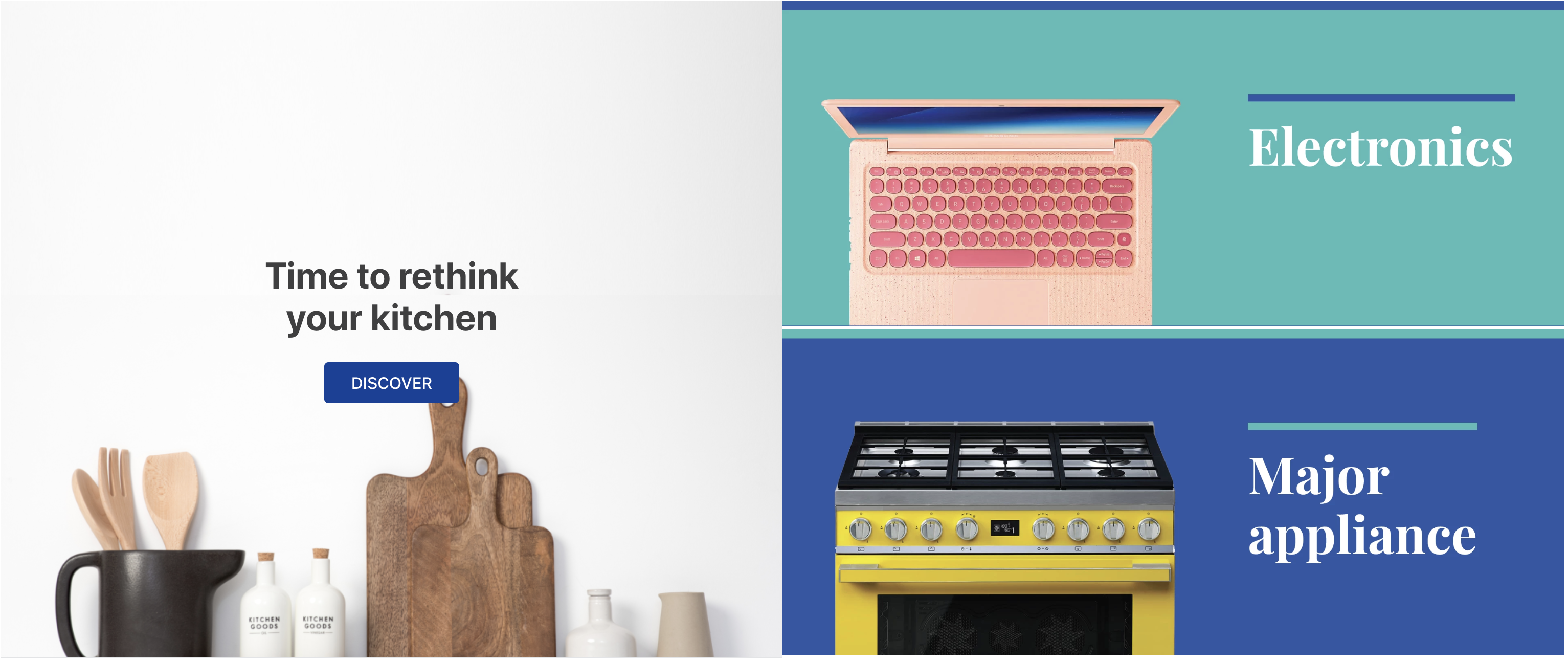
Below, we have an example of a flex layout comprised of a flex-layout.row with two children: an info-card and a rich-text:
  "flex-layout.row":{
    "children": [
      "info-card#rethink",
      "rich-text#delete"
    ]
  },

 "info-card#rethink": {
    "props": {
      "imageUrl": "https://appliancetheme.vteximg.com.br/arquivos/utensilios-cozinha-min.png",
      "isFullModeStyle": true,
      "headline": "Time to rethink your kitchen",
      "callToActionText": "Discover",
      "textPosition": "center"
    }
  },

  "rich-text#delete": {
    "props": {
      "text": "I'll be deleted soon"
    }
  }
Activity
-
Declare the
flex-layout.rowin thestore.home's templateblocksand then declare the blocks mentioned above in yourhome.jsoncfile. -
Edit the
flex-layout.rowchildren, substituting therich-textblock with aflex-layout.colcolumn. -
Delete the above-mentioned
rich-textblock from your theme. -
Declare the
flex-layout.colblock in yourhome.jsoncfile with two image components as children:image#electronicsandimage#major-appliance, in this order. -
Define the
imageblocks with the following props:... "image#electronics": { "props": { "src": "https://appliancetheme.vteximg.com.br/assets/vtex.file-manager-graphql/images/electronics_banner___25d69b49f8224b369375e68513b4d593.png", "maxWidth": "100%" } }, "image#major-appliance": { "props": { "src": "https://appliancetheme.vteximg.com.br/assets/vtex.file-manager-graphql/images/major_appliance_banner___bb10093866a127345ddfbcca3efa5022.png", "maxWidth": "100%" } }
The result should be similar to this:
ℹ️ Remember to access the Flex Layout documentation in case you have any questions during the activity.
If you're still unsure as to how to send your answers, click here.