You signed in with another tab or window. Reload to refresh your session.You signed out in another tab or window. Reload to refresh your session.You switched accounts on another tab or window. Reload to refresh your session.Dismiss alert
👋 - Hey there! First off - just wanted to say - love this design system so much! Using it with UI-Kitten is so intuitive and refreshing.
I'd love to see the following feature to make it even better and more developer friendly.
Let me know if this isn't the right place for this issue - I'd be happy to open it wherever is appropriate.
Thanks in advance!
Issue
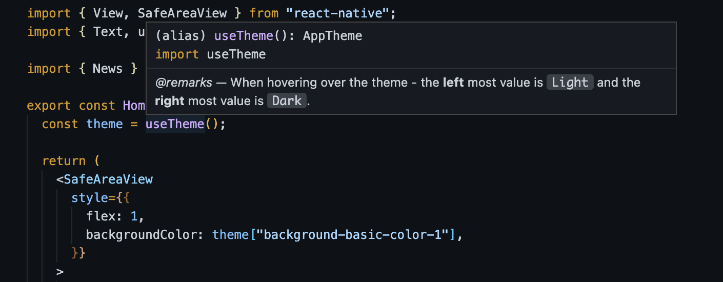
Currently the theme type from the useTheme hook is Record<string,string>.
While this is technically accurate, there are a lot of theme variables. This is of course amazing! It does - however - make it difficult to know what exists at a glance.
Proposal
As a user of this library - I'd like the ability to utilize TypeScript intellisense to help me identify which variables are available to me without having to consult the UI Kitten theming page.
Examples:
Intellisense
Screen.Recording.2022-11-24.at.9.28.35.AM.mov
On hover - show values
Valuable JSDocs to help the user without having to consult documentation
Potential Solutions
I was able to get a quick and dirty version of this running by using the light.json and dark.json files (here from this repo.
From there it was a union type of Light and Dark - and a subsequent override of the useTheme function itself in a global.d.ts.
Here is a shortened example:
interfaceDarkTheme{"color-primary-100": "#F2F6FF";"color-primary-200": "#D9E4FF";"color-primary-300": "#A6C1FF";"color-primary-400": "#598BFF";"color-primary-500": "#3366FF";"color-primary-600": "#274BDB";"color-primary-700": "#1A34B8";"color-primary-800": "#102694";"color-primary-900": "#091C7A";
...
}interfaceLightTheme{"color-primary-100": "#F2F6FF";"color-primary-200": "#D9E4FF";"color-primary-300": "#A6C1FF";"color-primary-400": "#598BFF";"color-primary-500": "#3366FF";"color-primary-600": "#274BDB";"color-primary-700": "#1A34B8";"color-primary-800": "#102694";"color-primary-900": "#091C7A";
...
}typeAppTheme=LightTheme|DarkTheme;declare global {
module "@ui-kitten/components"{export*from"@ui-kitten/components";// 👈🏼 export the same module/** * @remarks * * When hovering over the theme - the **left** most value is `Light` and the **right** most value is `Dark`. */exportfunctionuseTheme(): AppTheme;}}
Personally I think unwrapping the variables like $color-basic-100 could be valuable since most IDE's (especially VSCode) allow for easy Hex to color Visualization inline (if a developer so chooses) - thus furthering the productivity of a developer who is trying to theme their app appropriately.
👋 - Hey there! First off - just wanted to say - love this design system so much! Using it with UI-Kitten is so intuitive and refreshing.
I'd love to see the following feature to make it even better and more developer friendly.
Let me know if this isn't the right place for this issue - I'd be happy to open it wherever is appropriate.
Thanks in advance!
Issue
Currently the
themetype from theuseThemehook isRecord<string,string>.While this is technically accurate, there are a lot of theme variables. This is of course amazing! It does - however - make it difficult to know what exists at a glance.
Proposal
As a user of this library - I'd like the ability to utilize TypeScript intellisense to help me identify which variables are available to me without having to consult the
UI Kittentheming page.Examples:
Intellisense
Screen.Recording.2022-11-24.at.9.28.35.AM.mov
On hover - show values
Valuable JSDocs to help the user without having to consult documentation
Potential Solutions
I was able to get a quick and dirty version of this running by using the
light.jsonanddark.jsonfiles (here from this repo.From there it was a union type of Light and Dark - and a subsequent override of the
useThemefunction itself in aglobal.d.ts.Here is a shortened example:
Personally I think unwrapping the variables like
$color-basic-100could be valuable since most IDE's (especially VSCode) allow for easy Hex to color Visualization inline (if a developer so chooses) - thus furthering the productivity of a developer who is trying to theme their app appropriately.