Suggestion: Revamp Knacksteem's UI when accessed on a mobile phone to bolster user experience. #135
Description
I've been an ardent prophet of Knacksteem because I believe in its vision and I love the ideas from which the platform was created.
Most of the time, my operations on the website has been from my PC. But recently, I felt the need to get conversant with accessing the website on my mobile phone.
I've since found certain irregularities, especially when placed side-by-side with the website accessed on a PC.
The issue of UI on the mobile page cannot be overemphasized.
Knacksteem has a great UI. But, that can only be said for the PC version. To be honest.
The UI of the website on a mobile phone isn't up to par.
Here is the current view of Knacksteem's website accessed on my mobile phone.
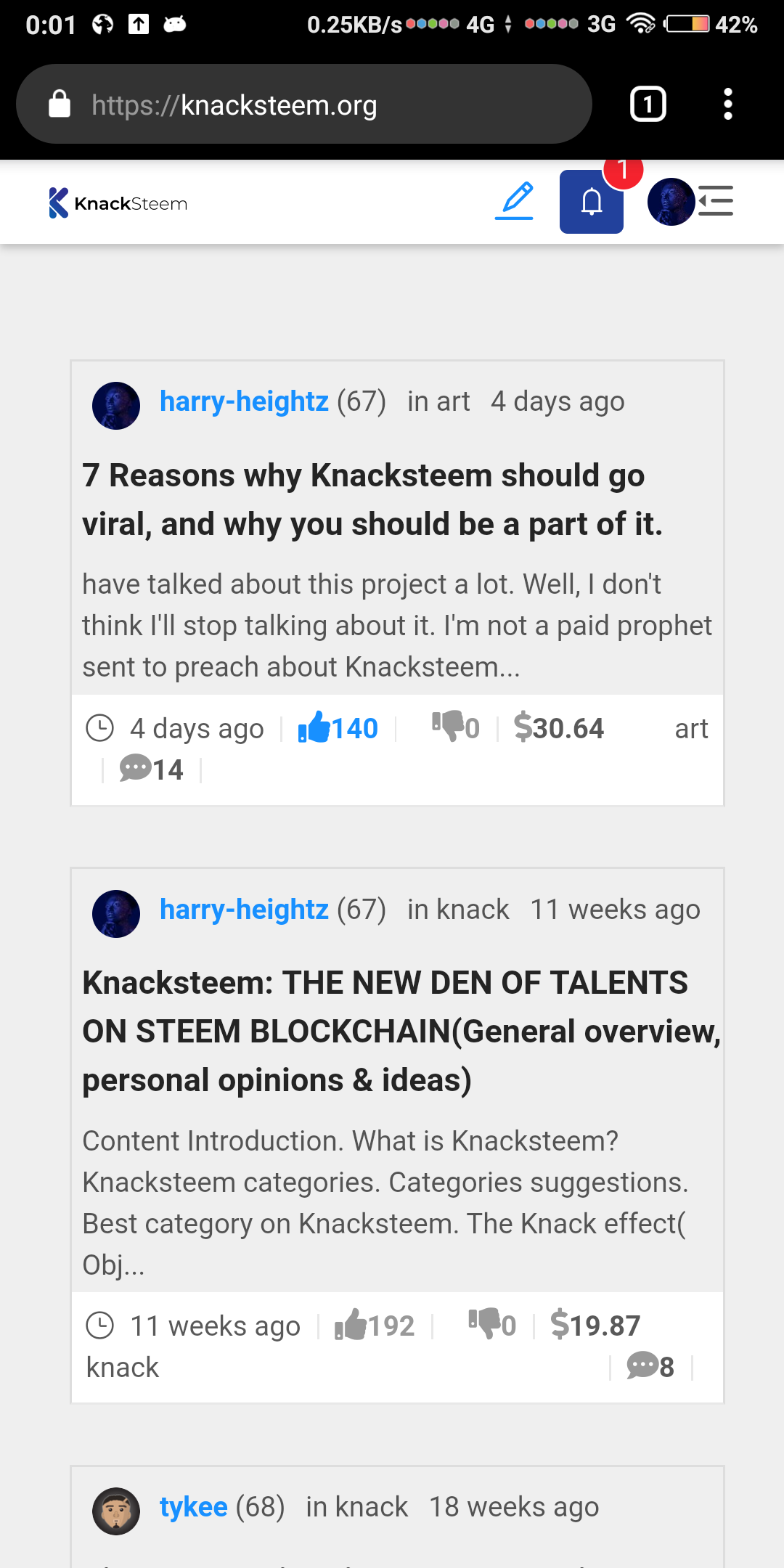
These are the issues I noticed;
Posts on the feed are displayed in a carded format.
The posts on the feed are constrained to fit into a sort of card.
This not only affects the post content but the button elements on it.
From the image I shared above, you will see that comments icon and article tag are not aligned on the same line as the other buttons.
For short category tags such as "art" it might not look so messy. But for category tag long as documentary, it's chaos.
The way to correct this issue is simple;
- Break the card display.
- Maximize the spaces on the screen.
- Use smaller fonts.
I wouldn't subscribe to the idea of smaller fonts though. It will be disastrous for people with sight problems.
I love the carded view, it gives the page a kind of class and style. Quite unique from other steem-based web apps.
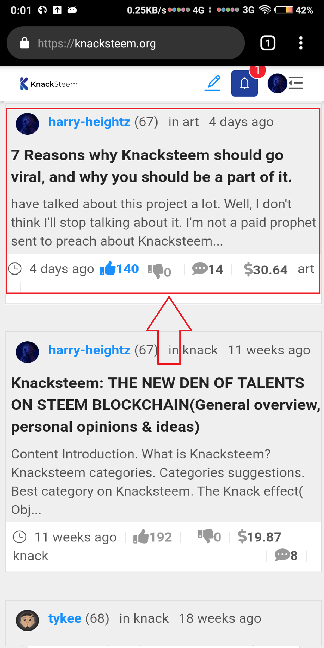
The best suggestion would be to maximize the space on the screen.
Constraining the feed in a card creates spaces both on the left and right of the screen. It would great to use up those spaces.
Here is a mockup of how the space can maximized;
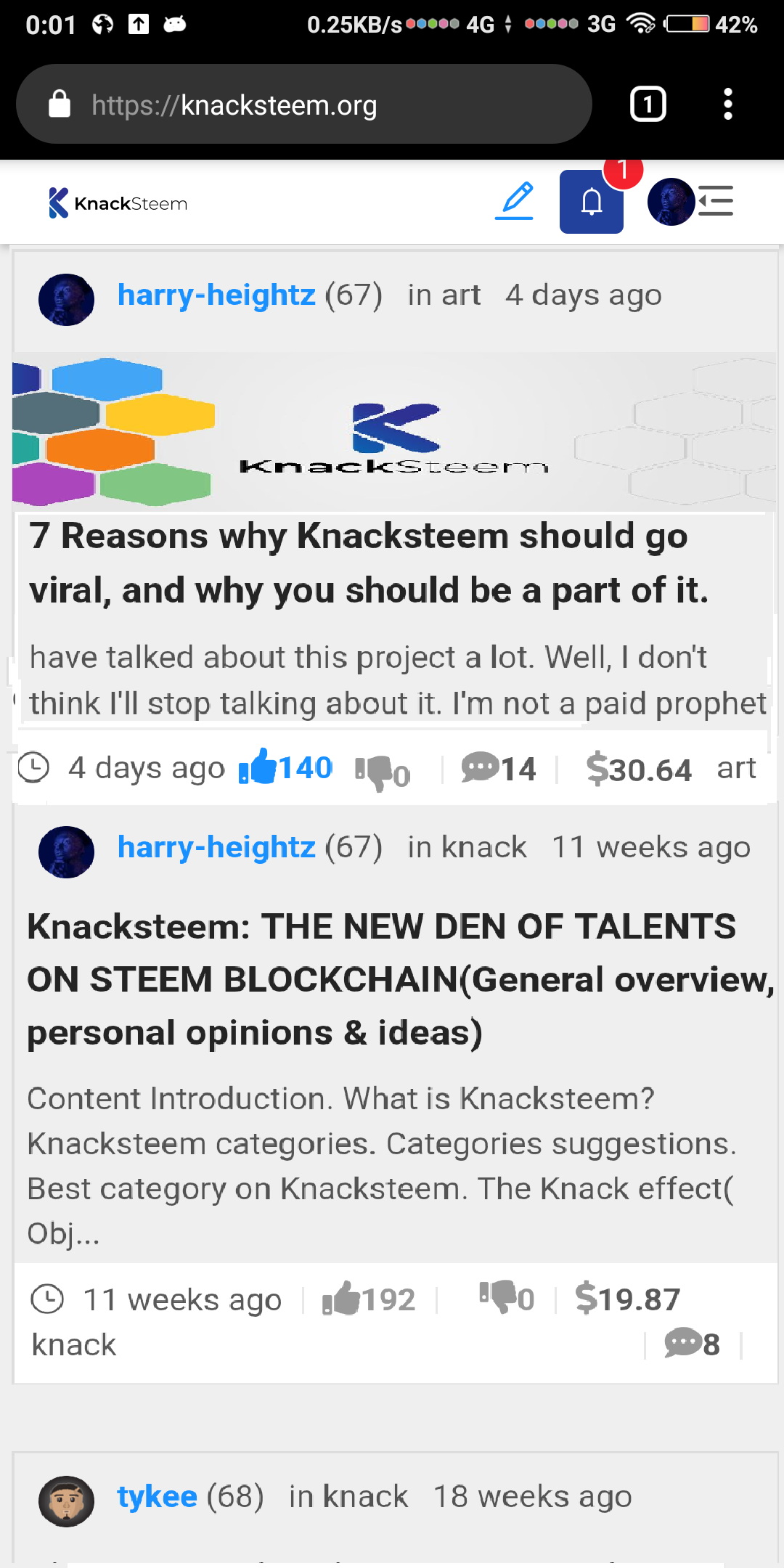
Cover image of posts are unavailable.
What influences a user to open a post and read it depends on two things.
- The post title
- The cover image
However, in my opinion, cover images are more influencing than post titles. Or, both of them are vital.
Sadly, the cover image isn't available when Knacksteem is accessed on a mobile phone.
Again, I think this has to do with improperly managing space.
From the image I shared of Knacksteem's current UI on a mobile phone, you will notice that;
post date and tags are shown up and down on the post preview.
The line of tag and date can be scrapped. Post age and tag can be shown only below.
What would now be there is just the author's name and the cover image of the post.
A lot of resizing still has to be done though, and that will be achievable if the card view is stretched.
Less space will be required to show the button elements and also preview texts.
Here is a mockup of how the cover image can be implemented;
My last suggestion might not be too serious. But it is good to pitch it in too.
The Knacksteem logo on the webpage which also signifies the home button, is too small. It would be better if the size was churned up a little bit.
Further more, the native upvote and downvote button would look better than thumbs up and down button, Those ones take their own fair share of space.
Benefits
Like I already stated in the title of this issue, revamping the UI would bolster user experience.
I enjoy surfing Knacksteem on my PC but I don't feel that same vibe when I do same on my mobile phone.