Dear Dr. McQueen and Dr. Elbert,
This is Jacob Steele from the PARADIM REU, I'll try to give information on the input/output/analysis process but just email me about any needed additional information.
Inputs: We get the inputs in .txt file formats with 2 or 4 columns (typically 4). The first column is the time while the other 3 columns are measured intensity (each one representing a different signal at the same time).
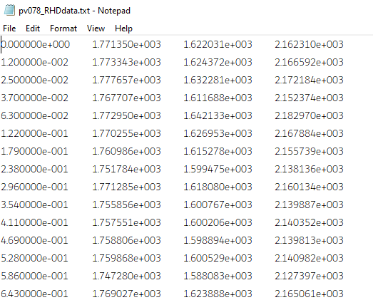
This is an example of some of the data.
The intensity has arbitrary units and is typically in the range of 1000-2000 at max intensity before exponentially decaying to ~500-800.
The time is done in very small increments of ~0.01s.
Output:
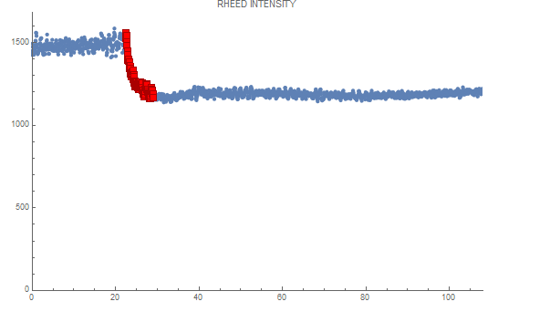
We want to plot these as intensity vs time plots, which typically take this shape:
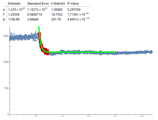
We then focus on the exponential decay region and want to fit this region to the equation: model = a*Exp[-(t)/T] + b
where t is time. The most important variable here is T as it is the time constant that we most want to pull out and analyze.
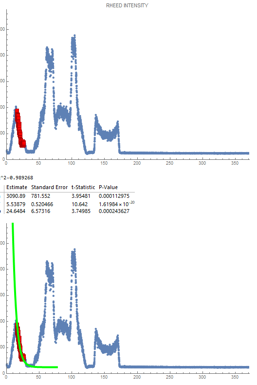
Ideally, we would also like an output of the fitted model to visualize it, as is done here:
Example workflow:
I have started work on automatic on the side in order to speed up my research and it has had moderate success.
My work is done in Mathematica here.
I start by loading in the txt and then selecting a column 2, 3, or 4 to work with and I plot the time-intensity data in a plot.
I then have a for loop to find the maximum intensity in the column I'm working with.
I then enter a value for a variable, "maxCutoff", which represent the percentage of the maximum intensity that I want to find.
The code then finds the first point (lowest t) that has an intensity <= the maximum intensity*maxCutoff and marks this as the start of the decay region. To deal with the noise that is experienced in many signals I generally do a maxCutoff of around 0.8, which corresponds to a point along the curve rather than right at the top. I then adjust the marked starting point back by a constant (usually 20) so that it can fit more of the curve in (up to this point is done automatically). From here this can be quickly visually fitted by adjusting maxCutoff and the constant shift to the starting point.
Next, to find the endpoint of the curve, I assign a value to a variable endCutoff (typically 1). The code then calculates the slope of from each point to the final point on the plot until the slope is beneath the value of the endCutoff. The first point that makes this value is then marked as the endpoint. In general, this is very good at finding the endpoint besides in unusual cases that probably shouldn't have the data used anyways, but it would be nice to be able to fit these as well. This also does find right near the bottom of the curve, but having some of the steady-state region has been found to improve the fitting, so it was found to be useful to add a constant value (typically 100-200) of points to this marked endpoint.
Finally, the code then takes the region between the marked start and endpoints and fits it to the model mentioned above, with seed values of 100000 for a, 5 for T, and 500 for b.
When fitting the data it is useful to be able to see some of the statistics of the fitting such as the standard error of T, which was our primary method of determining the fit quality.
With the method of fitting described above, around 80% of the data could be automatically fit with only slight alterations to the startCutoff and constant shift values for the endpoint and start point.
Issues:
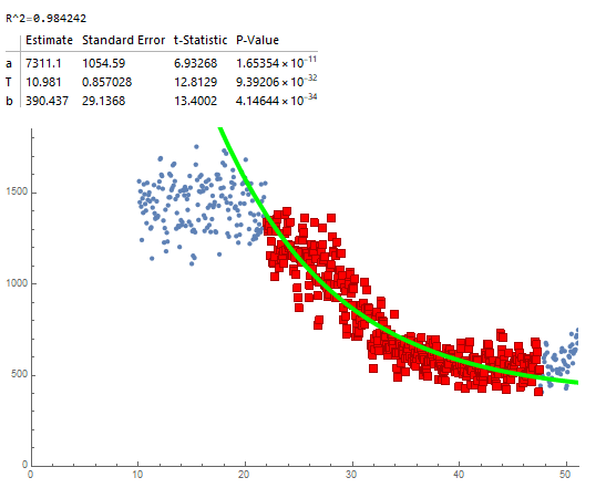
Common issues that appeared in the data are excessive noise and unusual behavior in the RHEED intensity. Some of this could be remedied by dropping many of the signals, but it is nice to fit them if possible. Examples of RHEED signals that caused issues are below.
Too much noise (was able to fit by adjusting maxCutoff to around 0.6 and then backtracking more than usual):
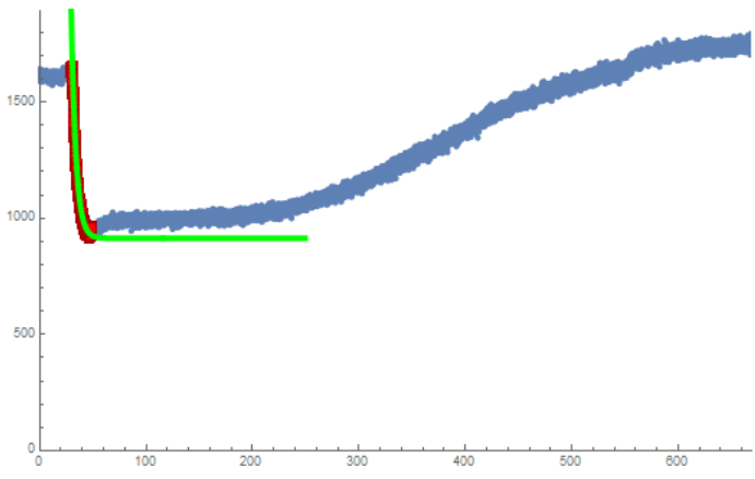
Unusual Behavior 1: Almost looks like an XRD signal, has a very unusual intensity distribution where the maximum intensity is much higher than the start of the initial decay. Additionally, there was no initial constant reason, so trying to use maxCutoff would not work as it marked somewhere on the incline of the first curve instead of in the decay. Additionally, due to the low initial starting location, the endCutoff was not able to be used as the first points had such low slope they were marked as the endpoints. This was fit by hardcoding the start and end points until it worked.
Unusual Behavior 2: The signal unusually increases after the decay region. This made endCutoff unable to be used since the endpoints were very far above the bottom of the decay. This was fit by hardcoding the endpoint.
Notes:
This was not the only ways of automatically choosing the start of the decay in my work. The endCutoff method was good enough that I did not try multiple.
Other methods of choosing the start point included finding the first 5-10 consecutive points with decreasing intensity, 5-10 consecutive points with a negative slope to the point 10 increments ahead, and finding the first point with a slope to the first point (t=0) greater than some constant.
These first two methods had nearly 0 success with large runs of negative values occurring before the decay region or having enough noise in the decay region to skip over it entirely.
The third method had limited success but having issues with signals that decline within the first few points as this leads to very large slopes with the small increment size on the x-axis. Since the signals have so much noise, this happened for most signals.
Thank you,
Jacob Steele
Dear Dr. McQueen and Dr. Elbert,
This is Jacob Steele from the PARADIM REU, I'll try to give information on the input/output/analysis process but just email me about any needed additional information.
Inputs: We get the inputs in .txt file formats with 2 or 4 columns (typically 4). The first column is the time while the other 3 columns are measured intensity (each one representing a different signal at the same time).

This is an example of some of the data.
The intensity has arbitrary units and is typically in the range of 1000-2000 at max intensity before exponentially decaying to ~500-800.
The time is done in very small increments of ~0.01s.
Output:

We want to plot these as intensity vs time plots, which typically take this shape:
We then focus on the exponential decay region and want to fit this region to the equation: model = a*Exp[-(t)/T] + b
where t is time. The most important variable here is T as it is the time constant that we most want to pull out and analyze.
Ideally, we would also like an output of the fitted model to visualize it, as is done here:

Example workflow:
I have started work on automatic on the side in order to speed up my research and it has had moderate success.
My work is done in Mathematica here.
I start by loading in the txt and then selecting a column 2, 3, or 4 to work with and I plot the time-intensity data in a plot.
I then have a for loop to find the maximum intensity in the column I'm working with.
I then enter a value for a variable, "maxCutoff", which represent the percentage of the maximum intensity that I want to find.
The code then finds the first point (lowest t) that has an intensity <= the maximum intensity*maxCutoff and marks this as the start of the decay region. To deal with the noise that is experienced in many signals I generally do a maxCutoff of around 0.8, which corresponds to a point along the curve rather than right at the top. I then adjust the marked starting point back by a constant (usually 20) so that it can fit more of the curve in (up to this point is done automatically). From here this can be quickly visually fitted by adjusting maxCutoff and the constant shift to the starting point.
Next, to find the endpoint of the curve, I assign a value to a variable endCutoff (typically 1). The code then calculates the slope of from each point to the final point on the plot until the slope is beneath the value of the endCutoff. The first point that makes this value is then marked as the endpoint. In general, this is very good at finding the endpoint besides in unusual cases that probably shouldn't have the data used anyways, but it would be nice to be able to fit these as well. This also does find right near the bottom of the curve, but having some of the steady-state region has been found to improve the fitting, so it was found to be useful to add a constant value (typically 100-200) of points to this marked endpoint.
Finally, the code then takes the region between the marked start and endpoints and fits it to the model mentioned above, with seed values of 100000 for a, 5 for T, and 500 for b.
When fitting the data it is useful to be able to see some of the statistics of the fitting such as the standard error of T, which was our primary method of determining the fit quality.
With the method of fitting described above, around 80% of the data could be automatically fit with only slight alterations to the startCutoff and constant shift values for the endpoint and start point.
Issues:
Common issues that appeared in the data are excessive noise and unusual behavior in the RHEED intensity. Some of this could be remedied by dropping many of the signals, but it is nice to fit them if possible. Examples of RHEED signals that caused issues are below.
Too much noise (was able to fit by adjusting maxCutoff to around 0.6 and then backtracking more than usual):

Unusual Behavior 1: Almost looks like an XRD signal, has a very unusual intensity distribution where the maximum intensity is much higher than the start of the initial decay. Additionally, there was no initial constant reason, so trying to use maxCutoff would not work as it marked somewhere on the incline of the first curve instead of in the decay. Additionally, due to the low initial starting location, the endCutoff was not able to be used as the first points had such low slope they were marked as the endpoints. This was fit by hardcoding the start and end points until it worked.

Unusual Behavior 2: The signal unusually increases after the decay region. This made endCutoff unable to be used since the endpoints were very far above the bottom of the decay. This was fit by hardcoding the endpoint.

Notes:
This was not the only ways of automatically choosing the start of the decay in my work. The endCutoff method was good enough that I did not try multiple.
Other methods of choosing the start point included finding the first 5-10 consecutive points with decreasing intensity, 5-10 consecutive points with a negative slope to the point 10 increments ahead, and finding the first point with a slope to the first point (t=0) greater than some constant.
These first two methods had nearly 0 success with large runs of negative values occurring before the decay region or having enough noise in the decay region to skip over it entirely.
The third method had limited success but having issues with signals that decline within the first few points as this leads to very large slopes with the small increment size on the x-axis. Since the signals have so much noise, this happened for most signals.
Thank you,
Jacob Steele