


Reusable toast UI primitives for React Native.
- Refactored into components, hooks, and utils.
- Built-in queue stack with max 3 toasts.
- New custom toast type.
- Default right color is #545D595E.
Yarn
  yarn add @tarmiz/react-native-toast
  yarn add react-native-reanimated react-native-safe-area-context react-native-responsive-screen lucide-react-native expo-blur expo-linear-gradient

Npm
 npm install @tarmiz/react-native-toast
 npm install react-native-reanimated react-native-safe-area-context react-native-responsive-screen lucide-react-native expo-blur expo-linear-gradient
import React from "react";
import { Pressable, Text, View } from "react-native";
import { ALERT_TYPE, useBlurToast } from "@tarmiz/react-native-toast";

export const Example = () => {
  const { Toast, show } = useBlurToast();

  return (
    <>
      <View>
        <Pressable
          onPress={() =>
            show({
              textBody: "Saved successfully",
              type: ALERT_TYPE.SUCCESS,
              duration: 3000,
            })
          }
        >
          <Text>Show toast</Text>
        </Pressable>
      </View>

      <Toast />
    </>
  );
};
You can use the new custom option to control icon + left/right colors + text.
import React from "react";
import { Pressable, Text } from "react-native";
import { Rocket } from "lucide-react-native";
import { ALERT_TYPE, useBlurToast } from "@tarmiz/react-native-toast";

export const CustomToastExample = () => {
  const { Toast, show } = useBlurToast();

  return (
    <>
      <Pressable
        onPress={() =>
          show({
            textBody: "Deploy started",
            type: ALERT_TYPE.CUSTOM,
            icon: Rocket,
            iconColor: "#7EE787",
            leftColor: "rgba(126, 231, 135, 0.35)",
            rightColor: "rgba(84, 93, 89, 0.37)",
            duration: 3500,
          })
        }
      >
        <Text>Show custom toast</Text>
      </Pressable>

      <Toast />
    </>
  );
};
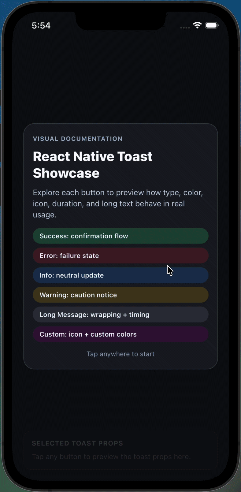
- ALERT_TYPE.SUCCESS
- ALERT_TYPE.INFO
- ALERT_TYPE.DANGER
- ALERT_TYPE.WARNING
- ALERT_TYPE.CUSTOM
Legacy error input is still supported and mapped internally to danger.
You can pass any valid color for leftColor and rightColor, including named colors, hex, and rgba.
Default behavior:
- Left color follows toast type color.
- Right color defaults to #545D595E.