drag-kit is a lightweight JavaScript library designed to implement drag-and-drop functionality for elements. It offers various configuration options, including initial positioning, position saving, drag area constraints, grid alignment, and auto-snapping. The library handles drag-and-drop issues within iframes and is compatible with major front-end frameworks such as Vue 2, Vue 3, and React.

- Basic Dragging: Drag specified elements.
- Cross-Device Support: Auto-detect device type, supports mobile phones, tablets (iPad), and PC with unified API.
- Axis Locking: Lock dragging to a specific direction (horizontal or vertical).
- Grid Alignment: Align dragging to a specified grid.
- Auto-Snapping: Automatically snap elements to viewport edges.
- Edge Buffering: Set a buffer distance between the element and the edges.
- Boundary Limiting: Prevent elements from being dragged outside a specified area.
- Position Saving and Restoring: Save drag positions to local storage and restore them on page reload.
- Iframe Compatibility: Handle drag issues within iframes to ensure compatibility.
- Framework Support: Works with Vue 2, Vue 3, React, and other major front-end frameworks.
- TypeScript Support: Complete type definitions with type inference and IntelliSense.
npm install drag-kitIn Vue, using the onMounted hook:
<template>
  <div id="draggableElement" style="display: none;">Drag me!</div>
</template>

<script lang="ts">
import { onMounted } from 'vue';
import { createDraggable } from 'drag-kit';

export default {
  setup() {
    onMounted(() => {
      createDraggable('draggableElement', {
        initialPosition: { x: '100px', y: '200px' }
      });
    });
  }
};
</script>
In React, using the useEffect hook:
import React, { useEffect } from 'react';
import { createDraggable } from 'drag-kit';

const DraggableComponent: React.FC = () => {
  useEffect(() => {
    createDraggable('draggableElement', {
      initialPosition: { x: '100px', y: '200px' }
    });
  }, []);

  return <div id="draggableElement" style={{ display: 'none' }}>Drag me!</div>;
};

export default DraggableComponent;
It's recommended to set the element's display to none before initialization to enhance the user experience.
createDraggable(elementId: string, options?: DraggableOptions): Draggable | MobileDraggable;Auto Device Detection: createDraggable automatically detects the current device type:
- Touch Devices: Returns
MobileDraggableinstance (touch events) - Desktop Devices: Returns
Draggableinstance (mouse events)
Parameters
- elementId: The ID of the element to make draggable. (Required)
- options: Configuration object with the following optional fields:
mode('screen' | 'page' | 'container'): Drag mode (screen, page, or container). Default isscreen. See details below.initialPosition: Initial position of the element, default x = 0, y = 0.dragArea(HTMLElement): Drag area (default isnull, meaning full screen). Required ifmodeiscontainer.lockAxis('x' | 'y' | 'none'): Lock dragging to a specific axis (x-axis, y-axis, or none).edgeBuffer(number): Edge buffer distance.gridSize(number): Grid size for alignment (default isundefined, meaning no grid alignment).snapMode('none' | 'auto' | 'right' | 'left' | 'top' | 'bottom'): Auto-snapping mode, default isnone.shouldSave: Whether to save the drag position to local storage.onDragStart: Callback function when dragging starts.onDrag: Callback function during dragging.onDragEnd: Callback function when dragging ends.
Detailed Explanation of mode Parameter
The mode parameter defines the drag area and determines where the element can be moved:
-
screenMode
The element can only be dragged within the current viewport, restricted to the screen boundaries. This mode is suitable for UI elements that need to remain within the screen, such as dialogs or toolbars. -
pageMode
The element can be dragged anywhere within the page boundaries, regardless of viewport limits. The element can be moved to any part of the page, and overflow can be scrolled to view. -
containerMode
The element can only be dragged within a specified container. The drag area is constrained by the container's boundaries. Set thedragAreaparameter to specify the container element. This mode is suitable for dragging within specific areas like panels or dialogs.
drag-kit supports mobile phones, tablets (iPad), and PC with complete cross-platform support and TypeScript type definitions:
The system automatically detects device type and selects appropriate drag implementation without additional configuration:
import { createDraggable, DraggableOptions } from 'drag-kit';

// Complete TypeScript type support
const options: DraggableOptions = {
  mode: 'screen',
  initialPosition: { x: '100px', y: '200px' },
  lockAxis: 'y',
  gridSize: 50,
  snapMode: 'auto',
  onDragStart: (element: HTMLElement) => {
    console.log('Drag started', element);
  },
  onDrag: (element: HTMLElement) => {
    console.log('Dragging', element);
  },
  onDragEnd: (element: HTMLElement) => {
    console.log('Drag ended', element);
  }
};

// Auto type inference: Draggable | MobileDraggable | null
const draggable = createDraggable('elementId', options);- Touch Dragging: Support single-finger touch dragging
- Prevent Scrolling: Automatically prevent page scrolling during dragging
- Multi-touch Handling: Only respond to the first touch point
- Full Compatibility: Support all PC features (grid, snapping, axis locking, etc.)
import { Draggable, MobileDraggable } from 'drag-kit';

// Force PC implementation
const desktopDraggable: Draggable = new Draggable(element, options);

// Force touch device implementation
const mobileDraggable: MobileDraggable = new MobileDraggable(element, options);

// Detect if it's a touch device (mobile/tablet)
const isMobile: boolean = MobileDraggable.isMobileDevice();To avoid performance overhead, it's recommended to destroy the draggable instance when the element is removed or the view is destroyed, especially when dragging is no longer needed.
Destroying the instance in Vue
<template>
  <div id="draggableElement" style="display: none;">Drag me!</div>
</template>

<script lang="ts">
import { onMounted, onBeforeUnmount } from 'vue';
import { createDraggable } from 'drag-kit';

export default {
  setup() {
    let draggable;

    onMounted(() => {
      draggable = createDraggable('draggableElement', {
        initialPosition: { x: '100px', y: '200px' }
      });
    });

    onBeforeUnmount(() => {
      draggable?.destroy();
    });
  }
};
</script>
Destroying the instance in React
import React, { useEffect } from 'react';
import { createDraggable } from 'drag-kit';

const DraggableComponent: React.FC = () => {
  useEffect(() => {
    const draggable = createDraggable('draggableElement', {
      initialPosition: { x: '100px', y: '200px' }
    });

    return () => {
      draggable?.destroy();
    };
  }, []);

  return <div id="draggableElement" style={{ display: 'none' }}>Drag me!</div>;
};

export default DraggableComponent;代码
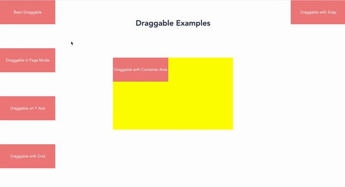
<template>
    <div class="example-container">
        <h1 style="padding-top: 80px;">Draggable Examples</h1>

        <!-- Basic Dragging (screen mode) -->
        <div id="draggable-screen" class="draggable" ref="basic">
            Basic Draggable
        </div>

        <!-- Page Mode Dragging -->
        <div id="draggable-page" class="draggable" ref="page">
            Draggable in Page Mode
        </div>

        <!-- Container Boundaries -->
        <div id="drag-container">
            <div id="draggable-bounds" class="draggable" ref="bounds">
                Draggable with Container Area
            </div>
        </div>

        <!-- Lock x-axis Dragging -->
        <div id="draggable-x-axis" class="draggable" ref="yAxis">
            Draggable on Y Axis
        </div>

        <!-- Grid Mode Dragging -->
        <div id="draggable-grid" class="draggable" ref="grid">
            Draggable with Grid
        </div>

        <!-- Snap Mode (screen mode) -->
        <div id="draggable-snap" class="draggable" ref="snap">
            Draggable with Snap
        </div>
    </div>
</template>

<script lang="ts" setup>
import { ref, onMounted } from 'vue';
import { createDraggable } from 'drag-kit';

const basic = ref<HTMLElement | null>(null);
const page = ref<HTMLElement | null>(null);
const bounds = ref<HTMLElement | null>(null);
const yAxis = ref<HTMLElement | null>(null);
const grid = ref<HTMLElement | null>(null);
const snap = ref<HTMLElement | null>(null); // New snap example

onMounted(() => {
    // Basic Dragging
    createDraggable(basic.value!.id);

    // Page Mode Dragging
    createDraggable(page.value!.id, {
        mode: 'page',
        initialPosition: { x: '0px', y: '200px' },
    });

    // Container Boundaries
    createDraggable(bounds.value!.id, {
        mode: 'container',
        dragArea: document.getElementById('drag-container')!, // Drag area is specified element
        edgeBuffer: 20,          // Set buffer distance to prevent exceeding boundaries
    });

    // Lock x-axis Dragging
    createDraggable(yAxis.value!.id, {
        lockAxis: 'y',
        initialPosition: { x: '0px', y: '400px' }
    });

    // Grid Mode Dragging
    createDraggable(grid.value!.id, {
        gridSize: 50,
        // snapMode: 'auto', // Snap every 50px while dragging
        initialPosition: { x: '0px', y: '600px' },
    });

    // Snap Mode Dragging (screen mode)
    createDraggable(snap.value!.id, {
      mode: 'screen', // Use screen mode
      snapMode: 'auto',
      initialPosition: { x: 'calc(100vw - 230px)', y: '0' },
    });
});
</script>
<style scoped>
.example-container {
    height: 1000px;
}
.draggable {
    width: 230px;
    height: 100px;
    line-height: 40px;
    background-color: lightcoral;
    display: flex;
    justify-content: center;
    align-items: center;
    color: white;
    cursor: pointer;
    z-index: 111;
}
#drag-container {
    width: 500px;
    height: 300px;
    background: yellow;
    position: fixed;
    left: 50%;
    top: 50%;
    transform: translate(-50%, -50%);
}
</style>drag-kit is a streamlined and efficient cross-platform drag-and-drop solution for mobile phones, tablets, and PC. If you have any suggestions or issues, please feel free to provide feedback on our GitHub Issues page.