Inline Calendar
Inline calendar shows the date picker of the calendar component directly in the form. The user cannot manually enter a date, just select from the picker.
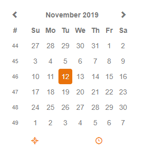
Table of contents
The component has the following properties:
| Property | Type | Default | Description |
|---|---|---|---|
| dataProvider | dataprovider | The dataprovider (a date column or variable) | |
| enabled | Boolean | true | Whether the component is enabled or not; blocks onAction, onDataChange events. |
| styleClass | String | Style class of this calendar | |
| toolTipText | String | Tooltip text shown when hovering over the calendar (i18n is supported) | |
| visible | Boolean | true | Whether the calendar is visible or not |
The component allows to attach handlers for the following events:
| Event | Parameters | Return | Description |
|---|---|---|---|
| onDataChange | oldValue:Date, newValue:Date, event:JSEvent | Boolean | Fired when the value is changed |
The component offers the following API methods:
| Method | Parameters | Return | Description |
|---|---|---|---|
| disableDates | dateArray:Date[], keepInvalid:Boolean | Sets a list of dates that cannot be selected in the picker | |
| disableDays | dayArray:Number[], keepInvalid:Boolean | Sets a list of days that cannot be selected in the picker | |
| setMinMaxDate | minDate:Date, maxDate:Date, keepInvalid:Boolean | Sets the minimum and maximum date that can be selected in the picker |