An interactive personal branding journey studio that transforms your goals and aesthetics into a tailored personal brand concept in less than 30 minutes. Build your brand visually on a freeform canvas through a 10-step guided journey, then export a complete brief for a brand designer you hire or yourself to continue the work.
This softwar is PROPRIETARY SOFTWARE - All Rights Reserved. This code is NOT open source. See LICENSE.txt for details.
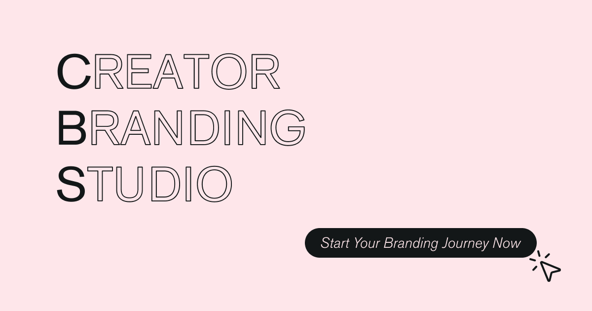
Creator Branding Studio is a minimalistic one-pager featuring a guided journey to help individual creators, small brands and freelancers to find where they stand and start expressing it visually for their audience. // Placeholder for an intro video.
The 10-phase branding journey includes:
- Goals Check - Define what you want to achieve with your brand
- Vibe Check - Explore adjectives that describe your brand personality
- Your Archetype - Discover your core brand archetype
- Core Motivations - Understand what drives your creative work
- Visual Lab - Curate visual inspiration and mood boards
- Typography - Select typefaces that match your brand voice
- Color Lab - Build your brand color palette with mapping
- Inspiration - Collect reference links and inspiration sources
- Design Principles - Define your design elements and principles
- Next Steps - Get your final brief and actionable next steps
- Drag & Drop Interface: Powered by react-dnd for seamless card-to-canvas interaction
- Inline Editing: Full text editing on canvas with Command/Ctrl+A support
- Dual Floating Toolbars: Glass-styled toolbars for quick access to tools
- Zoom Controls: Scale your canvas to see the big picture or focus on details
- Liquid Glass Design: Apple-style glassmorphism with colors #FEE6EA and #131718
- Work Sans Typography: Clean, professional typeface throughout
- Smooth Animations: GSAP-powered transitions and intro animations
- Cookie Consent: Bottom-attached banner with Google Analytics integration
- Mobile Responsive: Optimized for all devices
- Developer Mode: Hidden dev mode for unlocking all steps (for testing)
- Primary Pink:
#FEE6EA- Used for accents, buttons, highlights - Dark Charcoal:
#131718- Primary text and UI elements - Glassmorphism: Backdrop blur effects with translucent backgrounds
- Typography: Work Sans font family
- React 18 with TypeScript
- Vite build tool
- Tailwind CSS v4
- React Router (Data mode) for navigation
- Radix UI component library
- Motion (motion/react) for animations
- GSAP for advanced transitions and intro sequences
- react-dnd + react-dnd-html5-backend for drag-and-drop
- html2canvas-pro for canvas screenshots
- jsPDF for PDF export generation
- dom-to-image-more for image exports
- Material UI (@mui/material) for select components
- Recharts for any data visualization
- sessionStorage for state persistence
Copyright (c) 2026 Stella Achenbach. All Rights Reserved.
This is proprietary software. This tool represents significant creative and technical work. While the repository is public for transparency, the code itself is protected intellectual property. This means:
- ❌ NO copying - You may not copy, clone, or fork this codebase
- ❌ NO modification - You may not modify or create derivative works
- ❌ NO commercial use - You may not use this code for commercial purposes
- ❌ NO redistribution - You may not share, distribute, or sublicense this software
- ✅ Viewing only - You may view the source code for educational purposes
- ✅ Official use only - Use the tool through https://creator-branding.com/