Tweak admin redesign#15591
Conversation
Remove the table-scrollable
Which does not play nice with the person-dropdown when selecting a user above.
# Conflicts:
#	css/src/components/paper.css
 moorscode
added
the
changelog: non-user-facing
moorscode
added
the
changelog: non-user-facing
To restore general sanity when switching.
|
First collapsible open I prefer to have the first collapsible open, because it immediately gives the user an impression of the page content. With everything collapsed, I'm afraid that the user's first impression can be that there is “not much to do” on the page. I have sneakily closed this one, because I experienced by myself that I did not realize there were more settings for different items. Having the overview of all the things that have settings gave me a much better idea of what can be controlled vs what can be changed for a post-type. I also experienced that clicking one open, also made it super intuitive to close it. What are your opinions on this @thijsdevalk @jdevalk ? |
|
Other design principles
I think @jdevalk / @thijsdevalk have a strong opinion on this. Leaving that open from my end.
When I compared the Sketch to what was rendering in my browser; the 500 font-weight matched the design a lot better. I think this is because browsers and design-programs render these things differently.
I do think they work very well on most places, the dividers were giving a lot of extra horizontal cognitive load and reduced scannability; especially inside the papers with inputs nearby. Adding to todo
|
I agree with that. As long as 600 is changed to 500 everywhere. ;)
Ok, I think at least on the Features tab using the dividers would improve the usability a lot... |
|
Looking at the single switches (when not in a list), I think they can use a bit more margin top and bottom... Maybe 24px instead of 16px?
|
|
@thijsdevalk do we also want to change the |
|
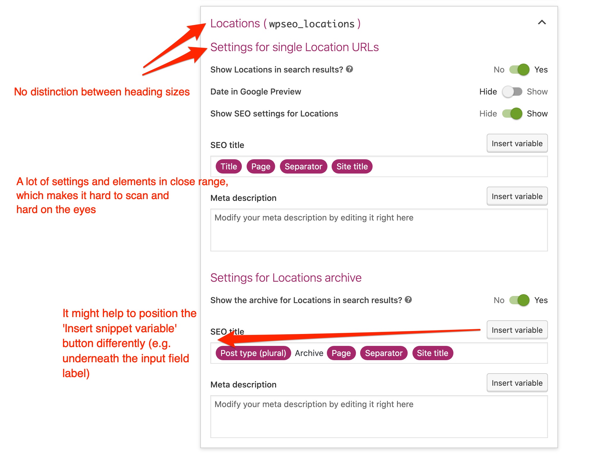
Adding to what @uxkai already shared: Visual hierarchy and whitespaceIn line with @uxkai's feedback; some sections feel a bit cramped or cluttered. This is due to a lack of visual hierarchy and whitespace in my opinion.
Papers and collapsiblesWith everything being paperized, I fear it becomes too random which sections should be collapsible and which shouldn't be. What will be the reasoning/pattern behind it? E.g. when a page becomes too long/large, we divide it into collapsible sections?
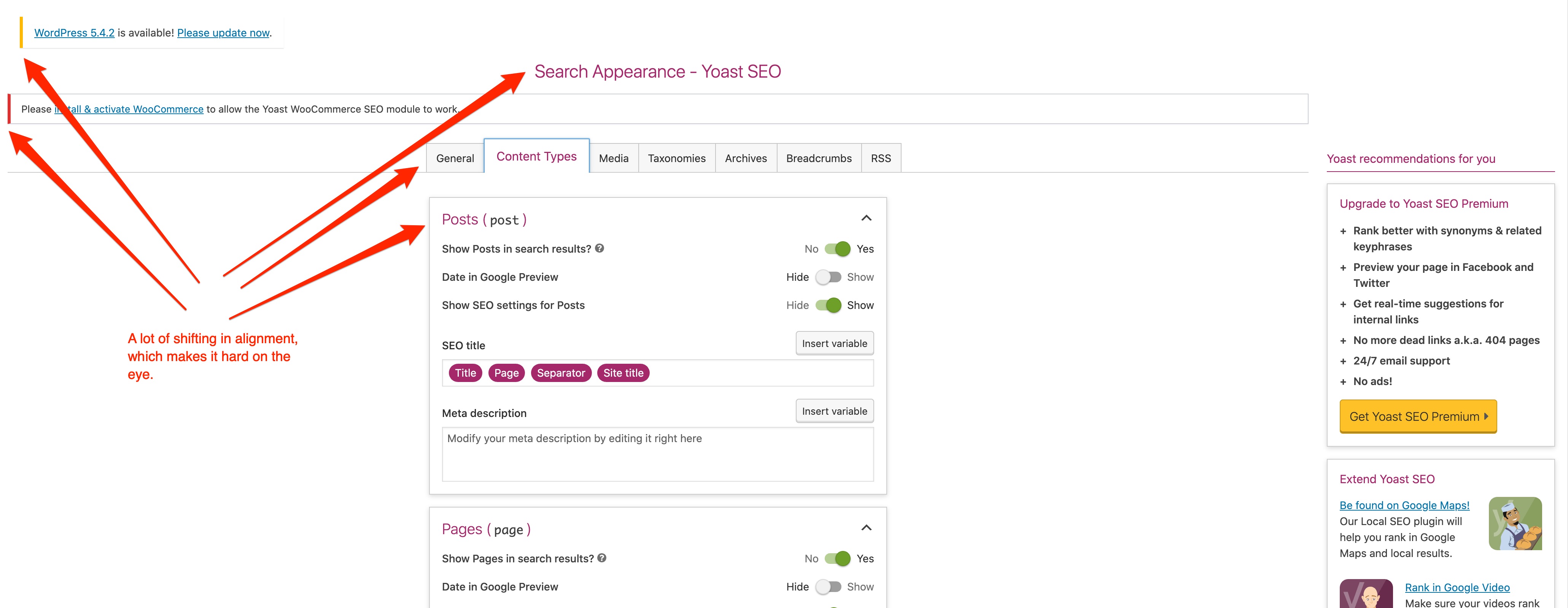
Shifting alignment because of centered contentBecause of the centered content there's some shifting of elements (see screenshot below). I agree with @uxkai and I'm worried that it might cause more problems than it solves. What was the reasoning behind centering it?
|
|
Interesting iteration! Love the attention to detail, and happy to see that all those padding/margin issues have been dealt with. I agree with most points that have been raised above. The tradeoff between visual clarity, consistency and hierarchical clarity is tricky sometimes. For instance, papers do bring organizational clarity but I feel like they also introduce visual noise. I keep missing the Save button that's wedged between the papers above and the upsell paper below it in Free. I think we once experimented with papers that only have a border, could be considered for a next iteration, those are a little 'lighter'. For the notififations icon we could maybe use the bell icon, which was finally added to dashicons recently - after I requested it a year ago 😁 https://iconify.design/icon-sets/dashicons/bell.html Other than that I don't immediately have any more points that haven't been mentioned above already. |
Two proposals:Note: This is still the "old" page design, but it's just to get an idea of how the variables will look on a whole page. 1. Change the purple background to #707070 (= our placeholder / meta text color): 2. The same styling as our secondary buttons, but without inset shadow: It depends a bit on how much you want these variables to stand out from the rest of the interface... |
|
@uxkai I really like the inset-shadow personally; can you also make a preview of how that would look in the metabox? |
|
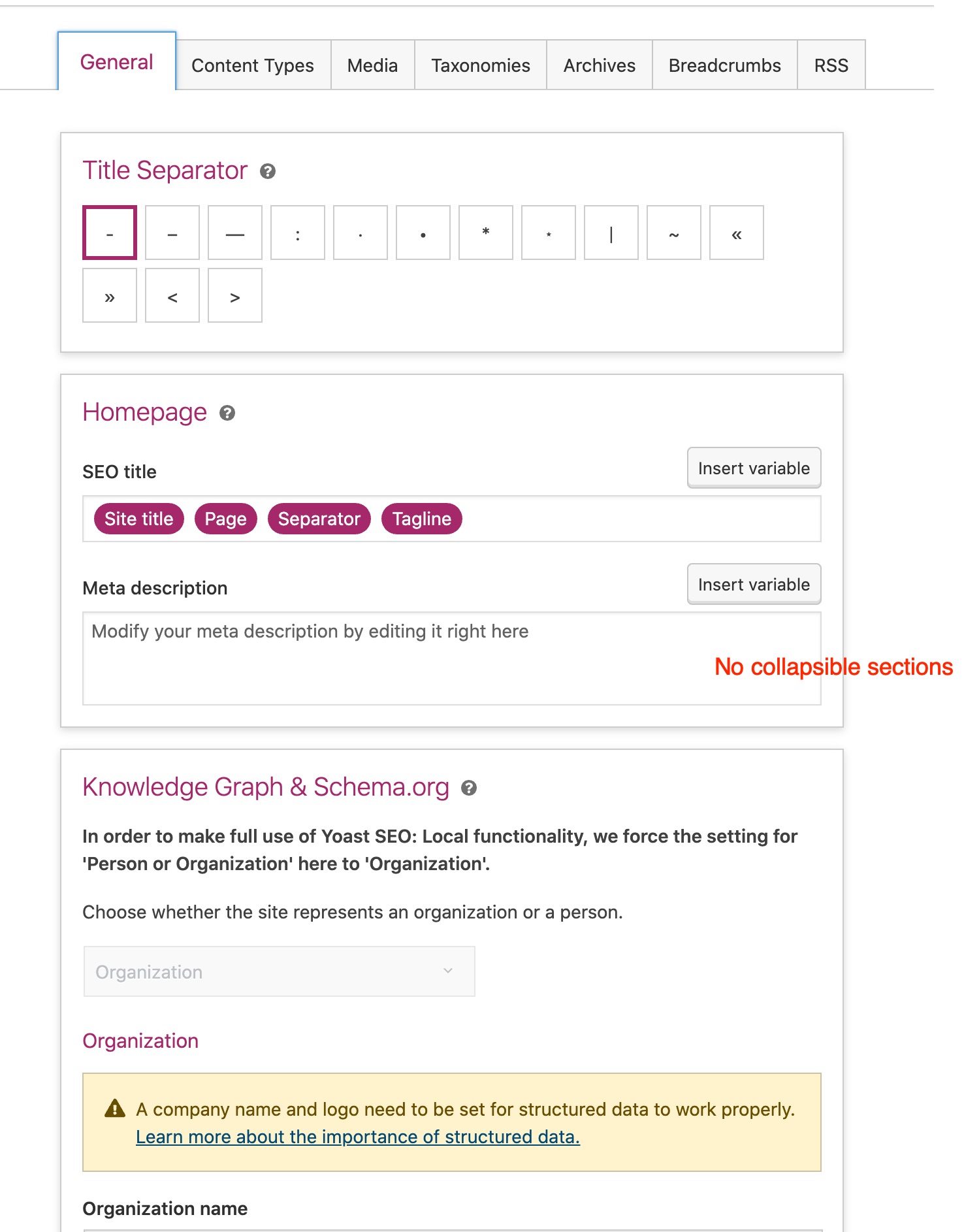
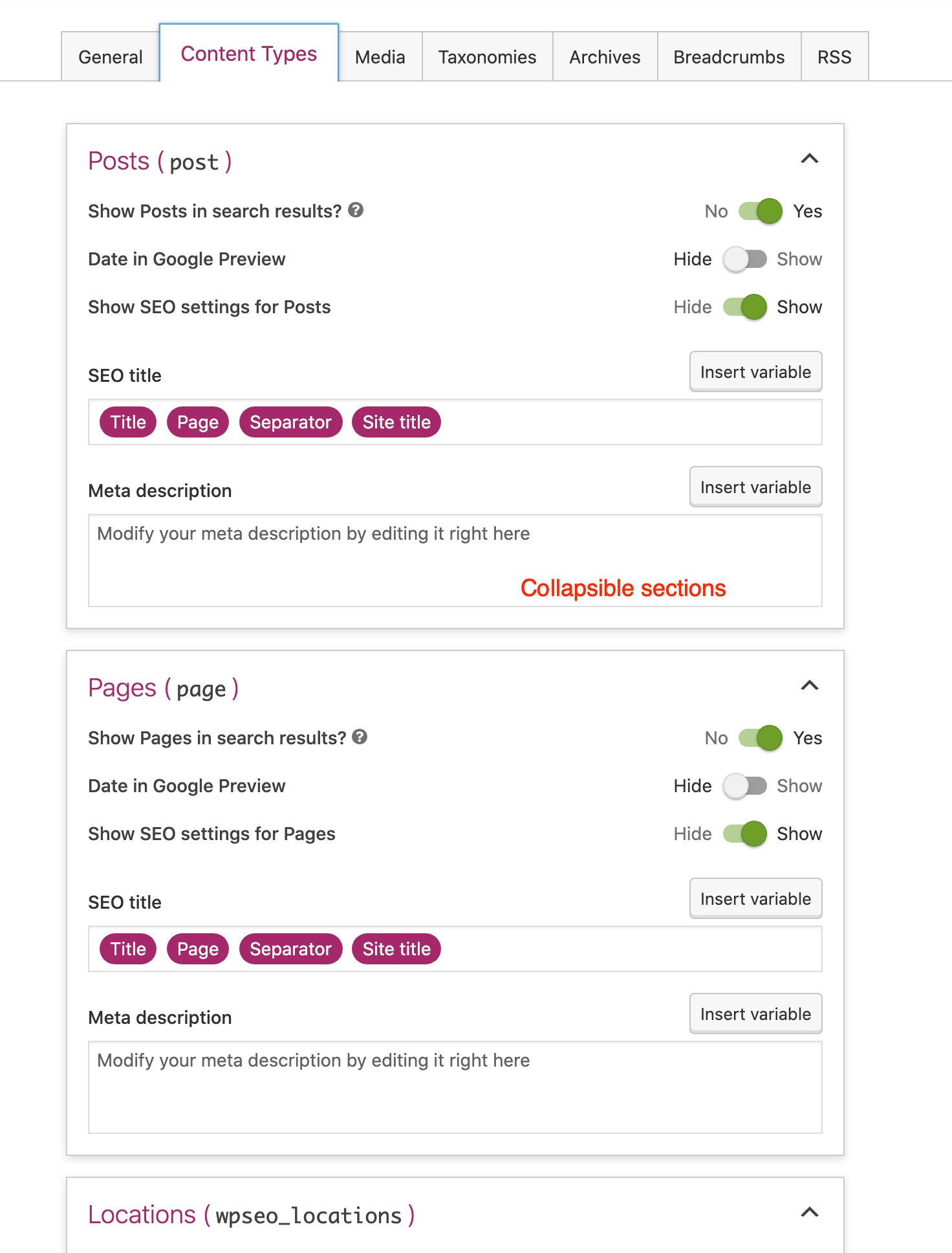
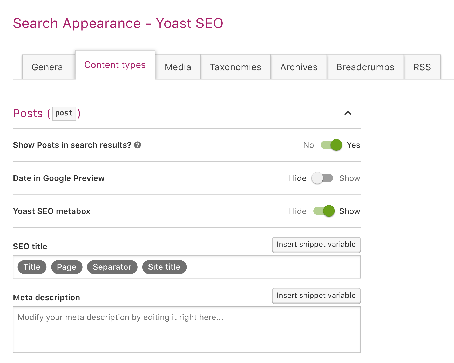
@luckickken The distinction between collapsibles and no collapsibles I made:
|
I agree, what is you proposed solution? |
|
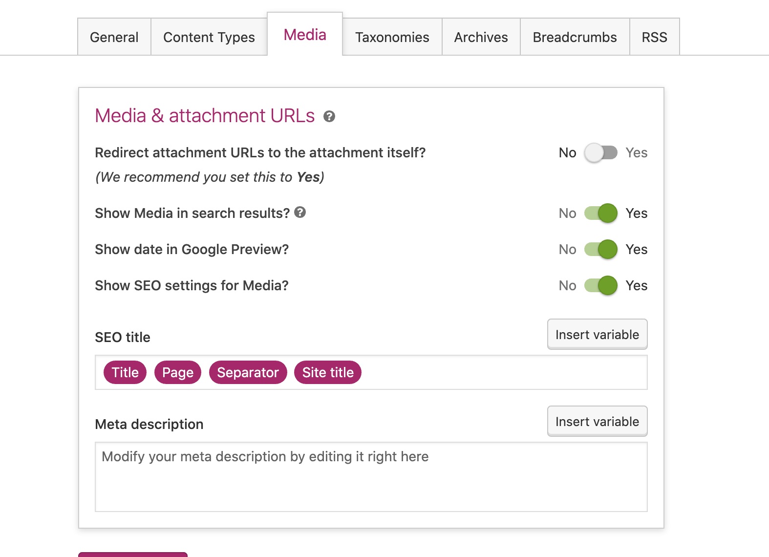
Regarding @thijsdevalk remark for the "We recommend you set this to Yes":
We want to make sure the context is clear which setting this applies to. |
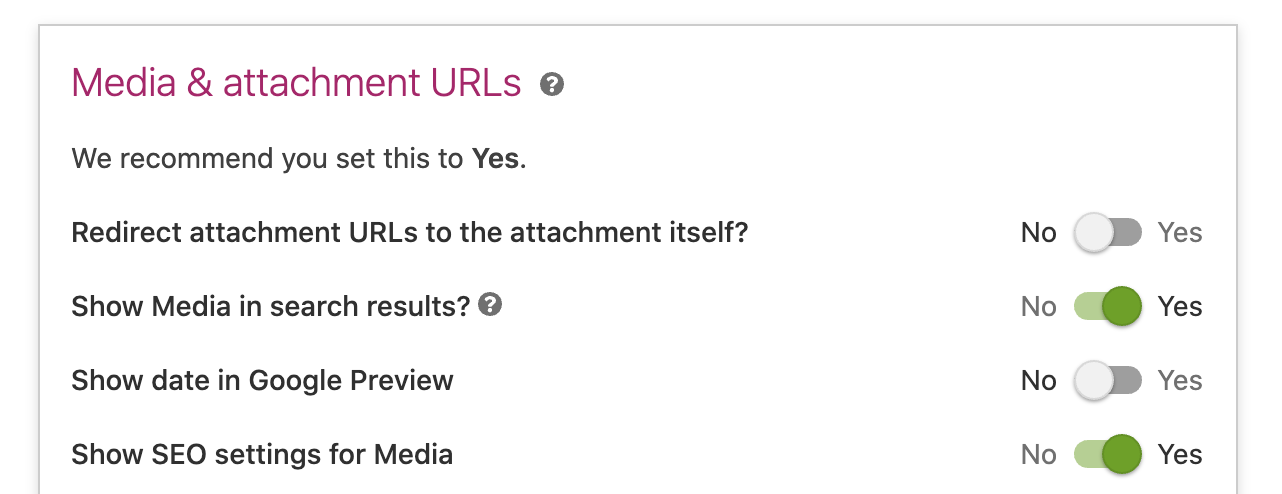
We could show that line underneath the setting (see screenshot below). Also I would pose each setting as a question, with question mark.
I like this.
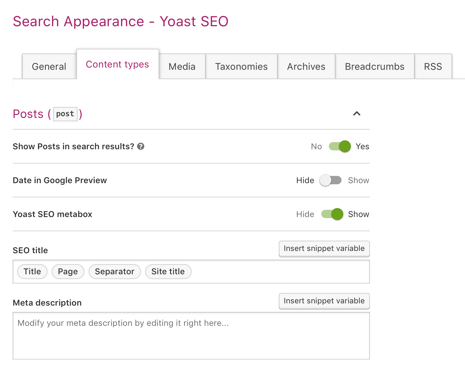
@uxkai could you make a proposal to improve the visual hierarchy, like I mentioned here. So:
|
|
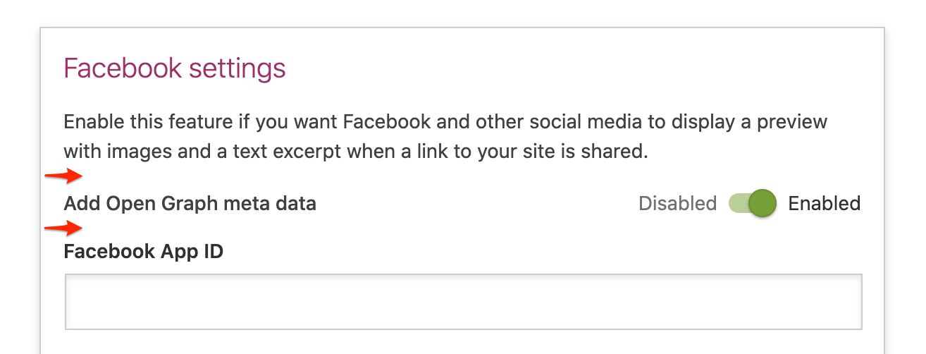
@jip, @uxkai concerning the toggle labels; I think it's possible to rewrite all of them to a question where the options are always Yes/No. A few examples:
This makes it more consistent and visually easier on the eye (no shifting toggles because of long labels). What do you think? |
This has been applied.
Agree, like confirmation of Product on this. |
6 participants
Context
This is linked to Yoast/javascript#751
Todo
Design
Category URLsto a collapsible box#444needs to be#303030Mobile design
General finishing up
Summary
This PR can be summarized in the following changelog entry:
Relevant technical choices:
Test instructions
This PR can be tested by following these steps:
yarn link-monorepoand check out the branch of that PRgrunt build:js build:cssin the Plugin to build the assets after linking and checking out the branch on the monorepo.UI changes
Documentation
Quality assurance
Fixes #