A sleek and customizable icon picker component for React, built with shadcn/ui and Lucide Icons.
- 🎨 Modern and responsive UI
- 🔍 Real-time icon search
- ⚡️ Progressive icon loading
- 🎯 Full Lucide icons support
- 🌗 Dark mode compatible
- 🎛️ Highly customizable
npx shadcn@latest add "https://icon-picker.alan-courtois.fr/r/icon-picker"pnpm dlx shadcn@latest add "https://icon-picker.alan-courtois.fr/r/icon-picker"npx shadcn@latest add "https://icon-picker.alan-courtois.fr/r/icon-picker"bunx shadcn@latest add "https://icon-picker.alan-courtois.fr/r/icon-picker"import { IconPicker } from "@/components/ui/iconPicker";
export default function Home() {
return <IconPicker />;
}| Prop | Type | Default | Description |
|---|---|---|---|
value |
IconName |
- | The controlled value of the selected icon |
defaultValue |
IconName |
- | The default value of the selected icon |
onValueChange |
(value: IconName) => void |
- | Callback invoked when an icon is selected |
open |
boolean |
- | Controlled open state of the picker |
defaultOpen |
boolean |
false |
Default open state of the picker |
onOpenChange |
(open: boolean) => void |
- | Callback invoked when the open state changes |
children |
ReactNode |
- | The trigger element to open the icon picker |
searchable |
boolean |
true |
Whether the icon picker is searchable |
searchPlaceholder |
string |
"Search for an icon..." | The placeholder for the search input |
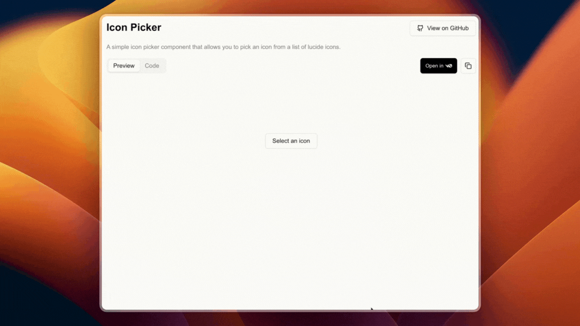
triggerPlaceholder |
string |
"Select an icon" | The text displayed on the default trigger button when no icon is selected |
iconsList |
IconList |
all lucide icons | The list of icons to display in the picker |
categorized |
boolean |
true |
Display icons in categories and add categories buttons to scroll to the desired category |
modal |
boolean |
false |
Whether the icon picker is being rendered in a modal |
git clone https://github.com/alan-crts/shadcn-iconpicker.gitnpm installnpm run devMIT © Alan Courtois