a website displaying secondary research on visual activism about its history and an analysis of its impacts
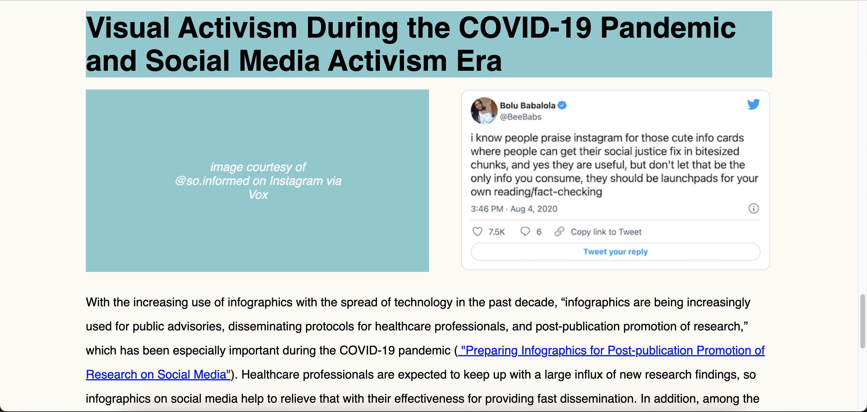
This website is a display of a secondary research project on visual activism. Especially with the events of summer 2020 and the pandemic, the explosion of aesthetic infographics informing users about various social inequalities and conveying complex data in digestible charts has changed how information and news has been shared online, especially on social media platforms. I answered: What is the evolution of data visualization and visual activism into the age of social media? As the political climate changes, more people turn to social media to advocate for social change. Some corporations have seen the change in climate and have used their social media for good. My other two team members explored the concept of performative activism within the scope of visual graphics, whether the actions of corporate social media accounts are genuine or moved by the prospect of profit, and how performative activism affects society and social movements.

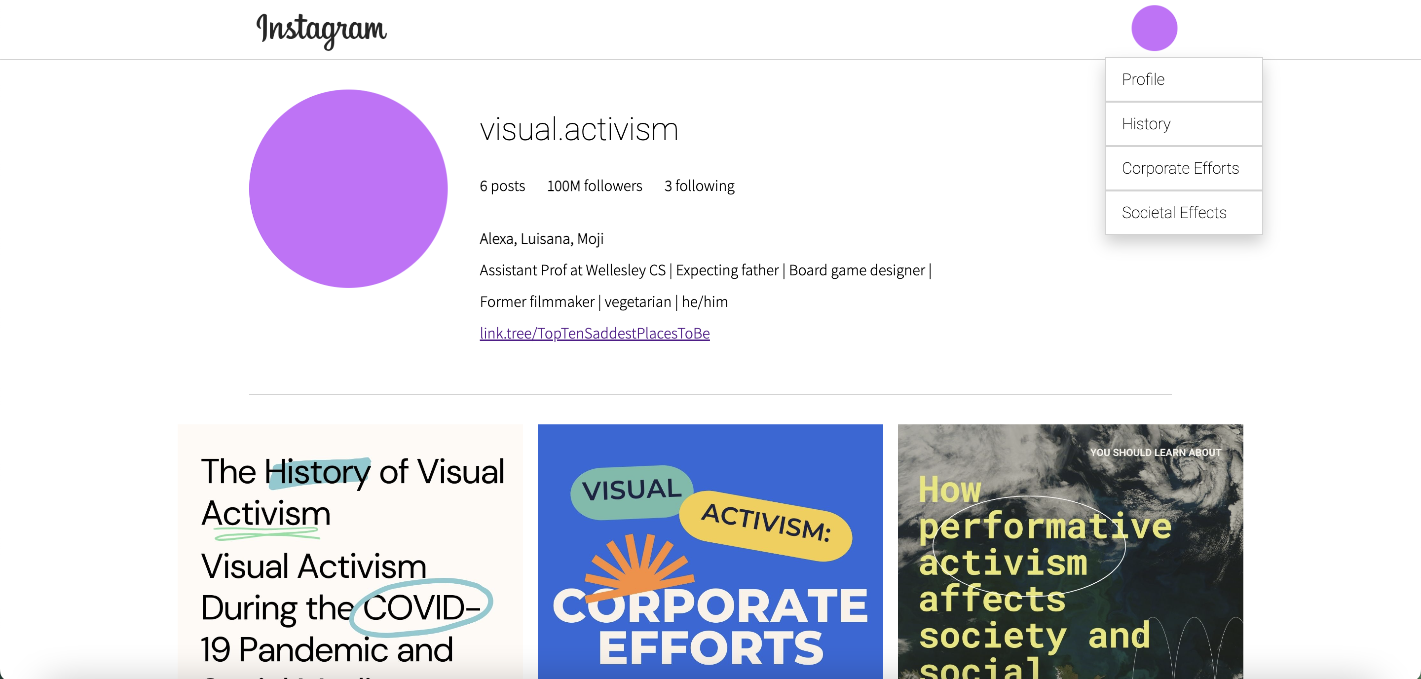
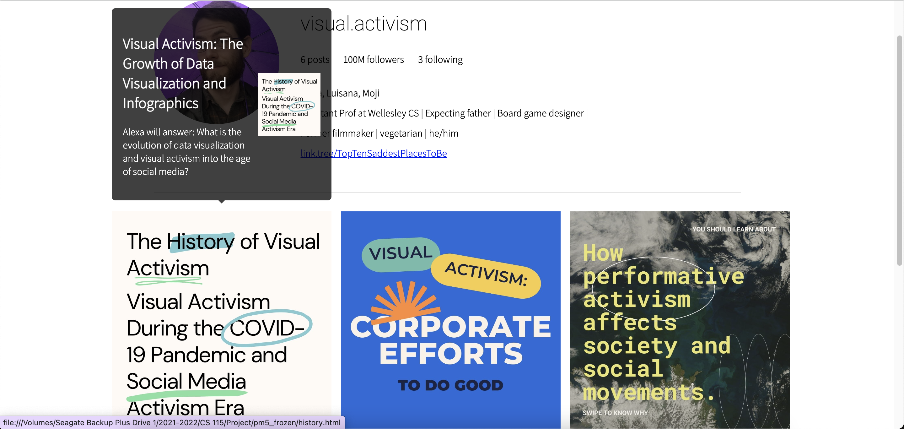
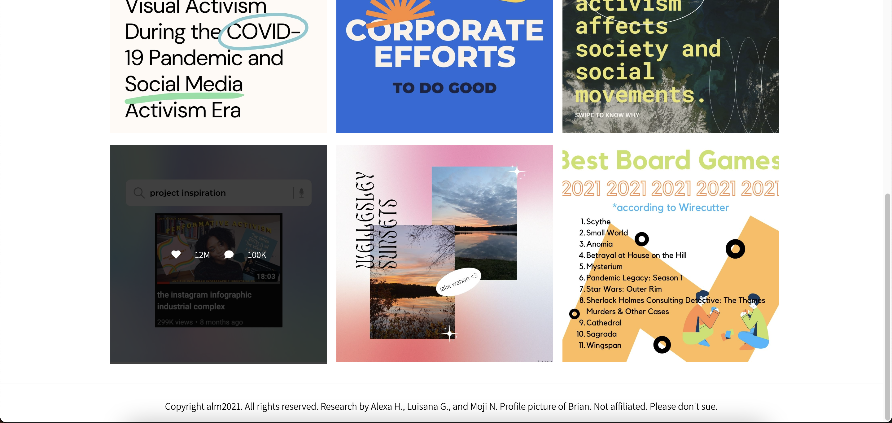
The website's homepage is a mock Instagram profile page, as this is the social media platform where infographics are primarily shared. The profile picture in the top right corner is clickable, revealing a dropdown navigation menu to other pages on the website. Hovering over the first three posts reveals a description of the research on that individual page, and clicking on one of those individual posts also accesses the page. Hovering over the second row of posts mimics the same display of likes and comments on Instagram desktop.
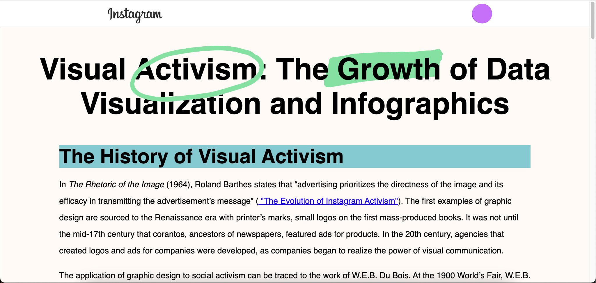
On my research page, hovering over any of the images reveals the cited source.