Check out the actual website! try!
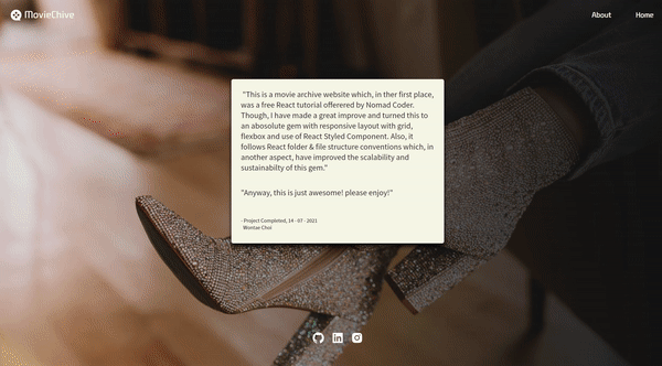
This project fetchs an movie list api, added with custom responsive design. It follows the conventional React folder structure which makes it scalable and sustainable. There are many reusable features such as custom useFetchAPIandPagination Hook, styled components and HashRouters, loading spinner. The social media icons at the header and footer leads to my social accounts, and About page contains a prologue of this project.
영화 JSON 데이터 API를 받아와 소개하는 웹서비스입니다. custom hook을 사용하였는데, Axios로 API에서 받아온 Json 데이터로 Pagination 기능을 구현했습니다. 특히 API를 받아올 때 비동기적으로 받아오는 Axios를 고려해 loading spinner로 사용자들의 비어있는 대기시간을 채웠습니다. Conventional React 폴더 구조를 따라 안정성 있고(sustainable)/확장(scalable) 가능합니다. 또한 styled-components와 media query를 이용하여 반응형 UI를 구현했습니다. 각각 스마트폰, 패드, 모니터 스크린에 맞춤인 UI를 가지고 있습니다.
- React Routing
(/src/App.js)
리액트 라우팅은 페이지를 넘어가도 새로고침이 되지 않는 웹앱을 구현할 수 있게 해줍니다.
function App() {
  return (
  <ThemeProvider theme={theme}> // default theme은 fonts, colors, breakpoints(반응형)등을 포함합니다
    <HashRouter>
      <GlobalStyle/>
        <Header/>
        <Route path="/" exact={true} component={Home}/> // Switch와 exact props를 사용하면 정확하게 매치되는 라우터가 아니면 라우팅을 하지 않습니다.
        <Route path="/home" exact={true} component={Home}/> // 페이지와 Component를 매칭하는 방법입니다. props로 전달합니다.
        <Route path="/about" exact={true} component={About}/>
        <Route path="/movie/:id" exact={true} component={Detail}/>
      <Footer/>
    </HashRouter>
  </ThemeProvider>
)}

export default App;- Custom Hook
(/src/hooks/useFetchMovieAndMakePagination.js)
npm react-paginate 라이브러리를 사용합니다.
import defaultAxios from "axios";

export const useFetchMovieAndMakePagination = (options, axiosInstance = defaultAxios) => {
    const [totalMovieList, setTotalMovieList] = useState([]);
    const [pageNumber, setPageNumber] = useState(0);
    const [isLoading, setIsLoading] = useState(true);
    // numOfMoviePerPage: 모니터 스크린 기준 한 페이지당 Movie Card
    // 반응형으로 하려면 스크린 사이즈마다 변하는 Dynamic state니까 useState로 관리해야 합니다.
    const [numOfMoviePerPage, setNumOfMoviePerPage] = useState(4);

    useEffect( ()=>{
        // Api fetching은 비동기 작업이기 때문에 useEffect훅에서도 비동기로 사용해야 합니다.
        const fetchMovieData = async () => {
            const response = await axiosInstance(options)
            const {data: {data: {movies : totalMovieList}}}= response
            setTotalMovieList(totalMovieList)
            setIsLoading(false);
        }
        fetchMovieData();
    }, []);

    useEffect( () => {
        // 맨 처음 렌더링, 즉 resize가 일어나지 않았을 때 setNumOfMoviePerPage
        const screenWidth  = window.innerWidth;
        if (screenWidth < 730) {
            setNumOfMoviePerPage(1);
        } else if (screenWidth < 960) {
            setNumOfMoviePerPage(2);
        } else {
            setNumOfMoviePerPage(4);
        }
        // 맨 처음 렌더링 이후, resize가 일어날 때마다 setNumOfMoviePerPage
        window.addEventListener('resize', () => {
            const screenWidth  = window.innerWidth;
            if (screenWidth < 730) {
                setNumOfMoviePerPage(1);
            } else if (screenWidth < 960) {
                setNumOfMoviePerPage(2);
            } else {
                setNumOfMoviePerPage(4);
            }
        });
    }, []);

    const numOfMovieDisplayed = pageNumber * numOfMoviePerPage
    const currentMovieList = totalMovieList.slice(numOfMovieDisplayed, numOfMovieDisplayed+numOfMoviePerPage)
    const totalCountOfPage = Math.ceil(totalMovieList.length / numOfMoviePerPage)

    const changePage = ({selected}) => {
        //  react-paginate has a prop named Selected
        setPageNumber(selected)
    }

    return {isLoading, currentMovieList, totalCountOfPage, changePage}
} - Styled-components & @media
(/src/components/Movie/MovieStyle.js 모든 styled component에 적용)
스마트폰, 패드, 모니터 스크린에 맞춘 반응형 UI를 구현합니다.
import styled from "styled-components"

export const MovieCard = styled.div`
    display: grid;
    grid-gap: 1em;
    grid-template-columns: 2fr 5fr;
    background-color: rgb(247 ,247 ,232);
    margin-bottom: 1em;
    padding-left: 1em;
    height: 22em;
    border-radius: 5px;
    box-shadow: 0 8px 10px rgba(0, 0, 0, 0.85), 0 1px 3px rgba(0, 0, 0, 80);
    @media ${(props) => props.theme.breakpoints.md} {
        width: 80%;
        margin: 0 auto;
    }
`