refactor(landing): replace identical-card grids in how-it-works and open-source#1940
refactor(landing): replace identical-card grids in how-it-works and open-source#1940fancyboi999 wants to merge 2 commits intomultica-ai:mainfrom
Conversation
…pen-source

Both sections rendered as equal-weight card grids: how-it-works as
4 columns and open-source as 2x2. On mobile, how-it-works stacked
into 4 unconnected blocks with white/28 numerals that were hard to read.

Replace both with non-grid layouts. how-it-works now uses large serif
numerals with a horizontal rule on desktop and a vertical timeline on
mobile. open-source uses a two-column narrative list where the first
item gets a serif emphasis and the rest are plain sans-serif headings
separated by divide-y.

i18n schema and copy are unchanged.
|
@fancyboi999 is attempting to deploy a commit to the IndexLabs Team on Vercel. A member of the Team first needs to authorize it. |
… sans scale

Drop the serif treatment on the first highlight. Use the same Inter font
for all four items, with the first at 22/24px font-semibold and the rest
at 17/18px font-semibold. Scale ratio is ~1.33, satisfying the
"≥1.25 between hierarchy steps" rule while keeping a single typeface.

Reason: the serif headline made item 0 feel visually disconnected from
the rest of the list, raising the question "is that an intentional
hierarchy or a bug". Same-typeface + size contrast preserves the
hierarchy without that ambiguity.
|
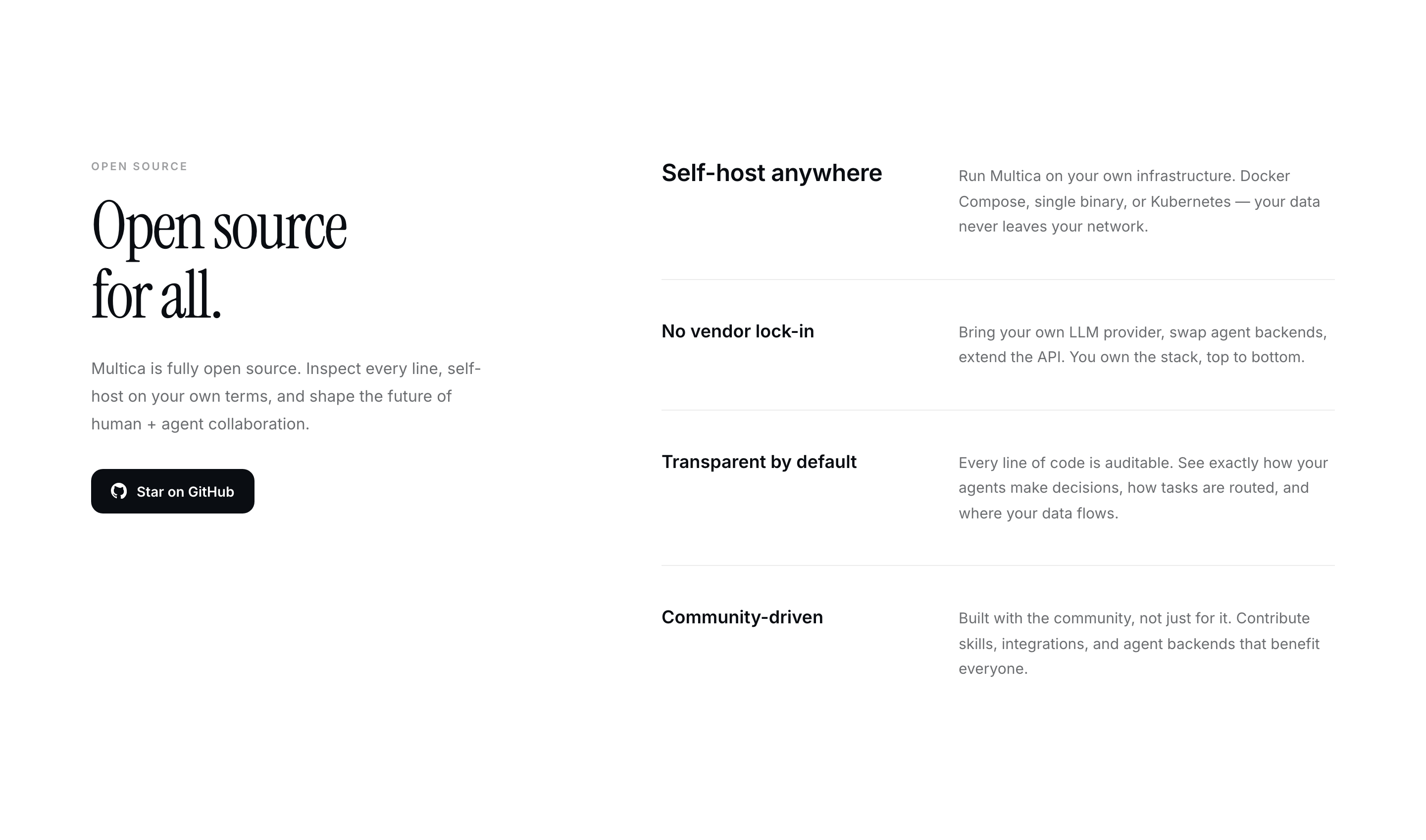
Pushed The previous version used Instrument Serif for the first highlight ("Self-host anywhere") and Inter for the rest. The intent was hierarchy via typeface contrast, but the practical effect was that item 0 read as visually disconnected from items 1–3, raising the legitimate question "is this a bug or intentional". Switched to a single typeface (Inter) with size contrast instead:
Ratio is ~1.33. Hierarchy is preserved, single-typeface consistency is restored, and the "different font means different category" ambiguity is gone. Updated screenshot in the PR description references the new asset commit on the
The first link is pinned to the previous asset commit; the second tracks the branch tip. |

Closes #1939.
Replaces the equal-weight card grids in
how-it-worksandopen-sourcewith non-grid layouts. Full motivation and the four "before" shots are in the issue; this PR has the implementation and the "after" shots side-by-side.How It Works
Desktop — 4 large serif numerals with a horizontal rule (arrow on 1–3, dot on 4):
Mobile — vertical timeline with a continuous left rail and
white/80numerals (waswhite/28):Open Source
Two-column narrative list. The first item ("Self-host anywhere") gets a serif headline — the most concrete differentiator earns more visual weight than the abstract ones.
divide-yfor separation, no card borders:Mobile stacks heading above description per item:
What I did NOT change
#how-it-works,#open-source) — anchor links still work.landingfiles or shared packages.Files touched: 2.
Validation
pnpm --filter @multica/web lintover the whole package reports 7 pre-existing errors inapps/web/app/not-found.tsx(@next/next/no-html-link-for-pages); they're untouched by this change.Manually verified at 1440px and 390px against
localhost:3000with locale forced toen. Screenshots above are from those runs.Trade-offs