Cover page
Our story is based on something the world is going through right now .The Pandemic .This study is focussed specifically on the second wave.
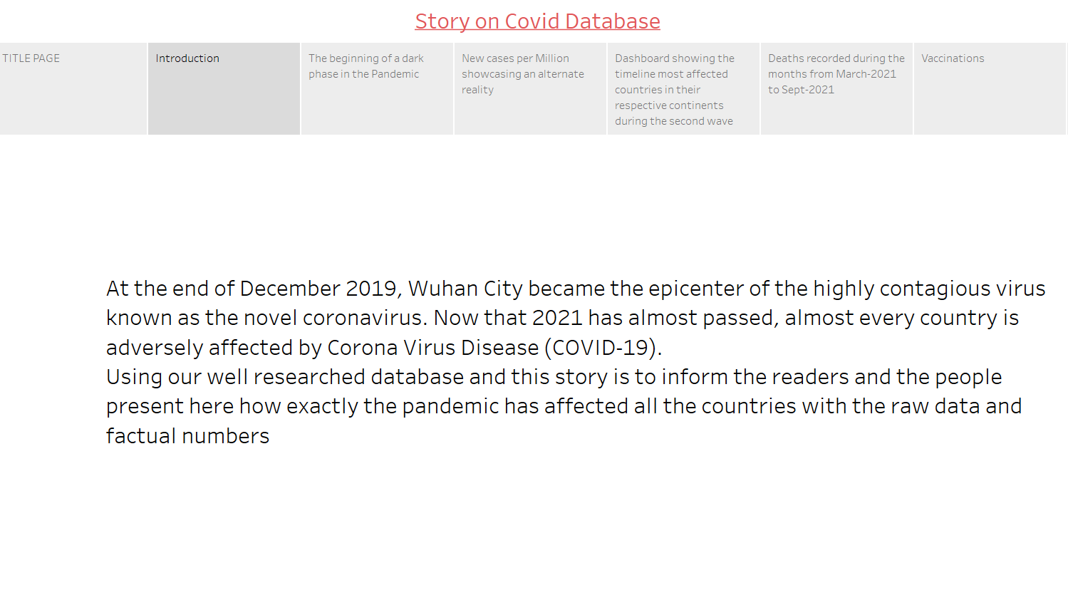
Introduction
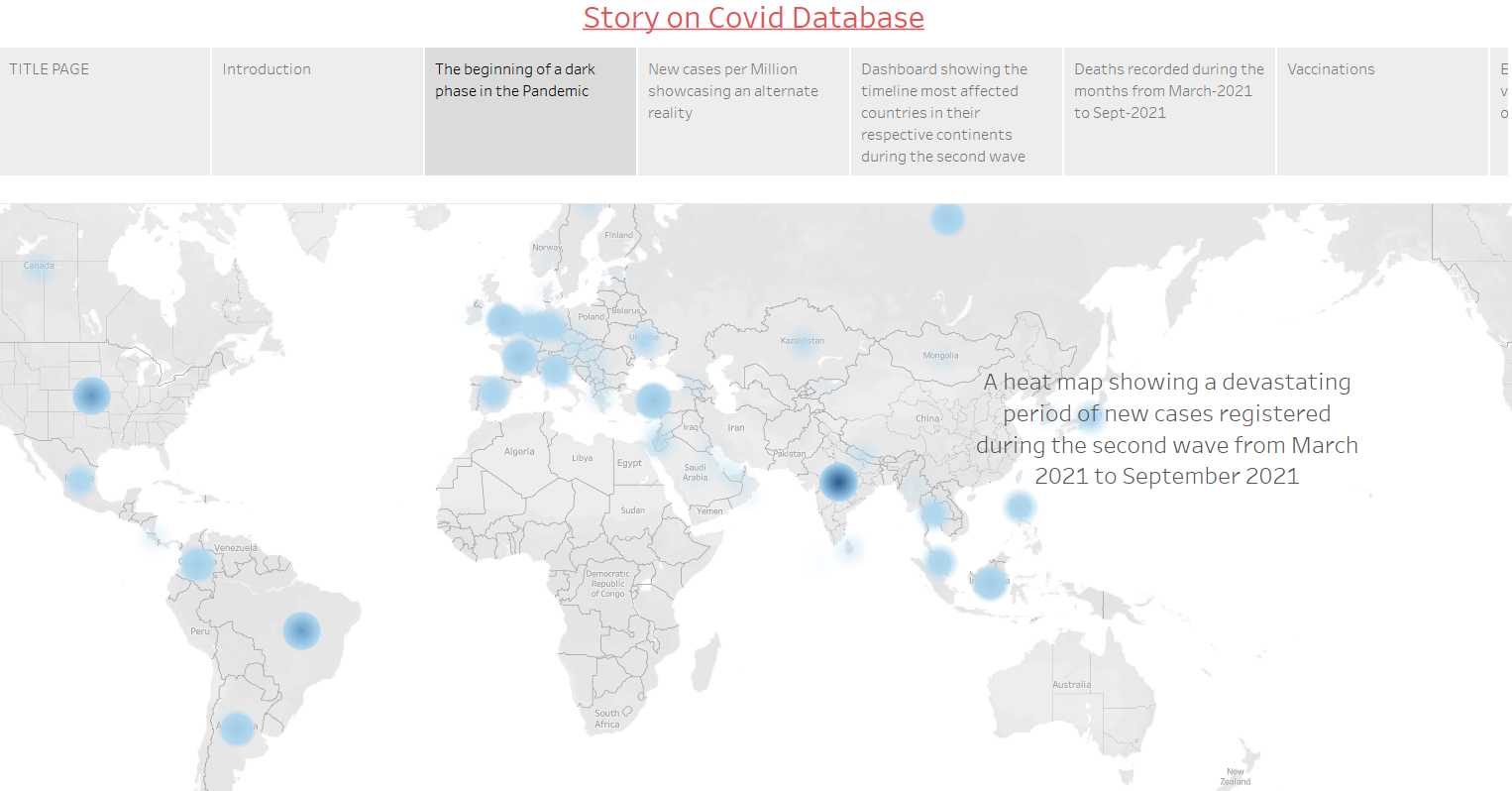
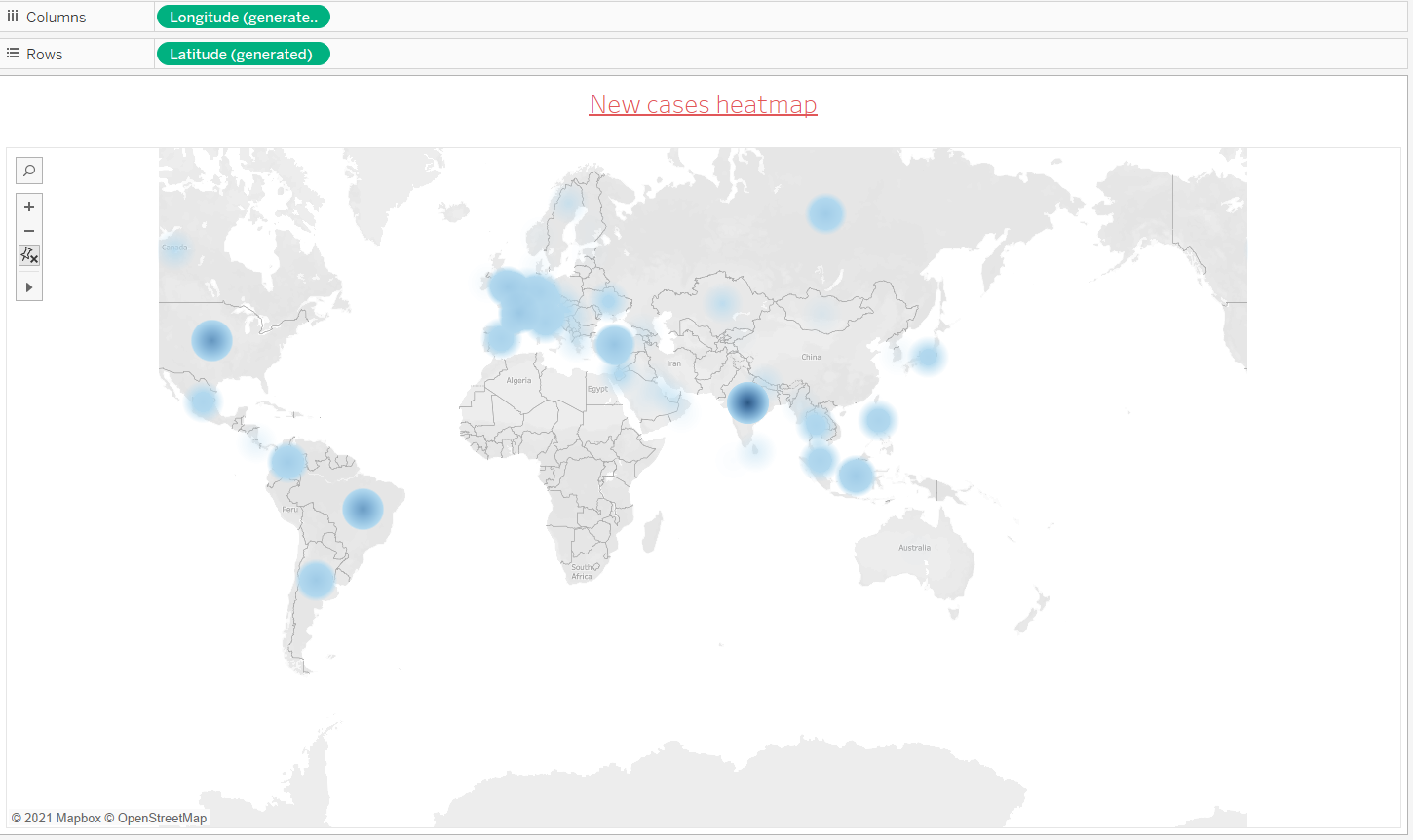
The begining of a dark phase in the pandemic .As we can clearly see,most parts of the world were affected by the virus .India was more severely affected as seen by the dark blue spot .This is a Heatmap showing effects of second wave on the world.
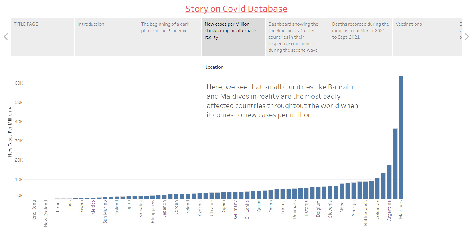
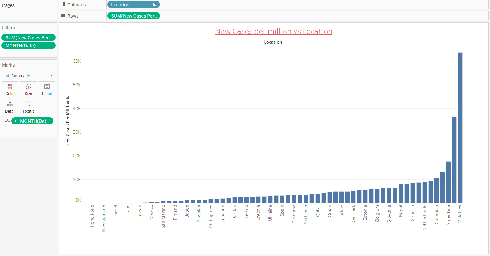
New cases per million showing worst affected countries.The smaller countries like Maldives and Bahrain seem to have been affected more
because of their lesser population .
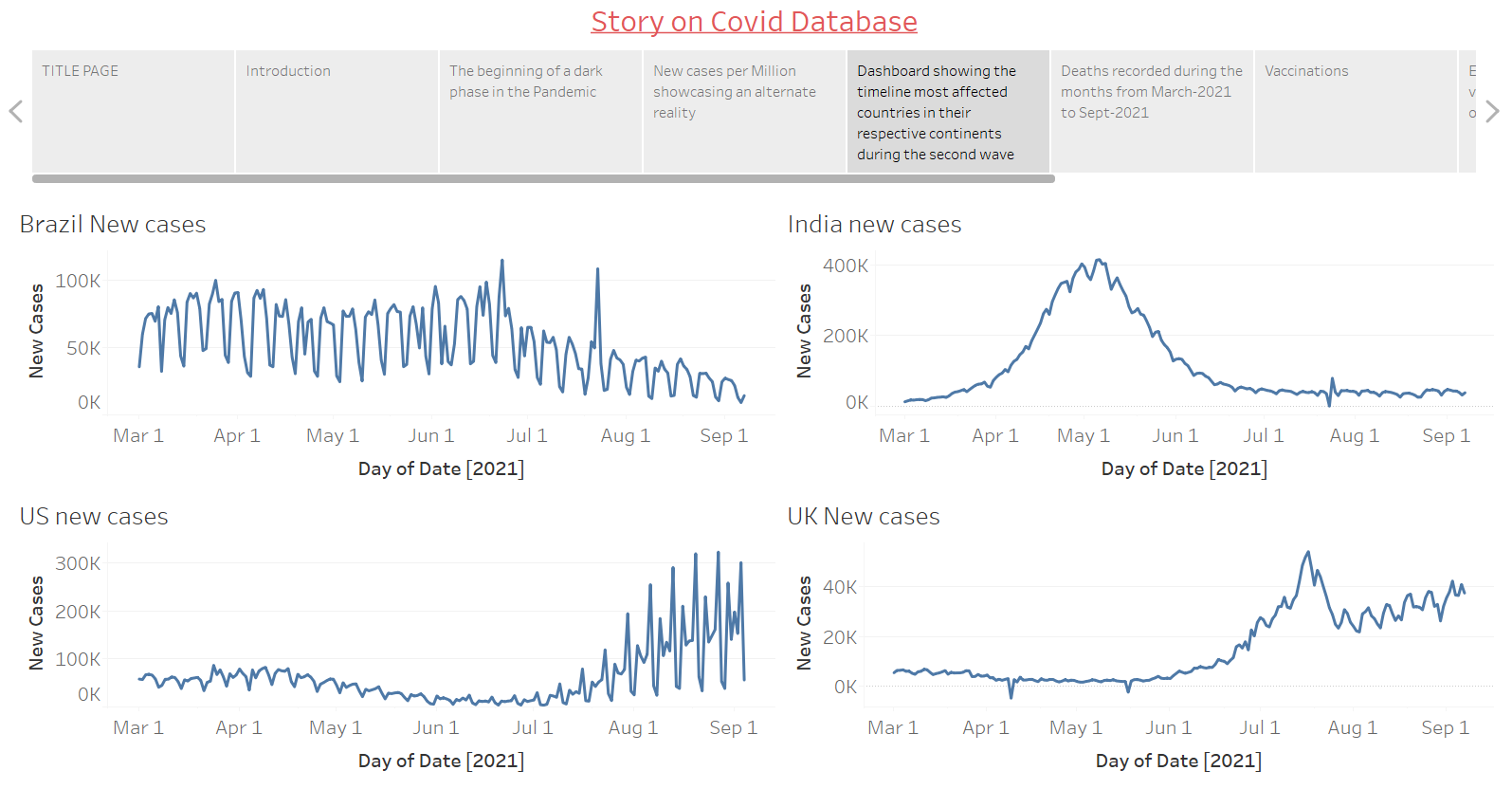
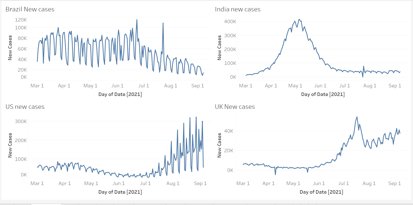
Dashboard comparing 4 most affected countries in their respective continents along with the months during which they were more affected .
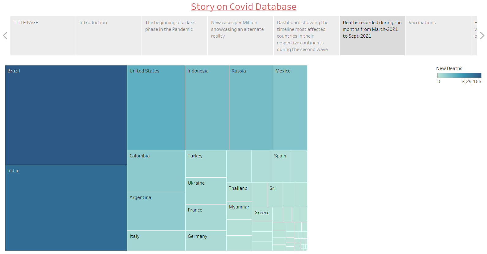
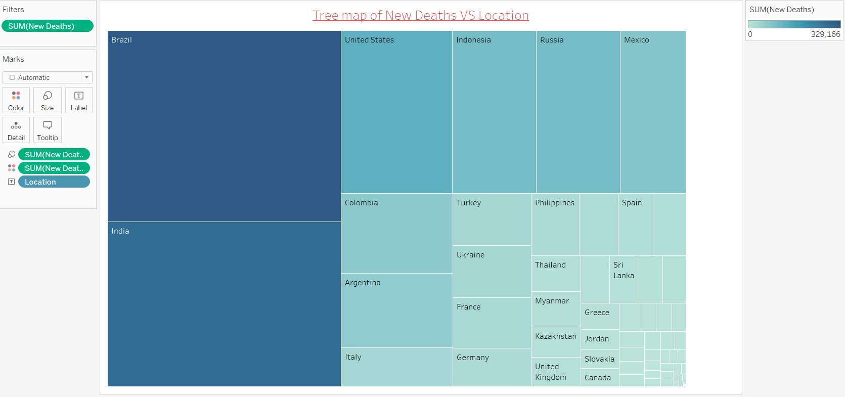
Treemap showing how many people lost their lives in the second wave in various countries.Brazil and India were affected the most.
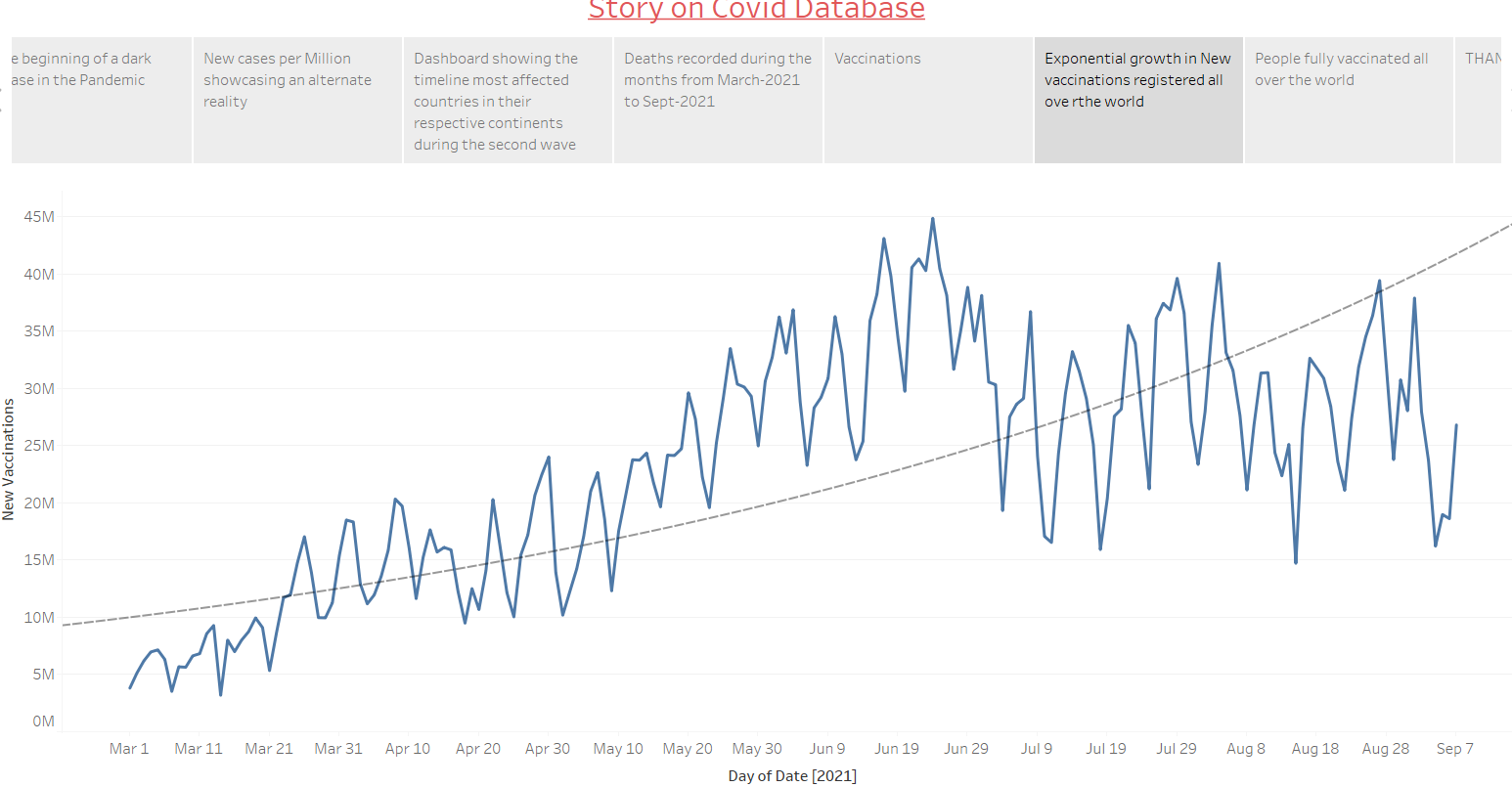
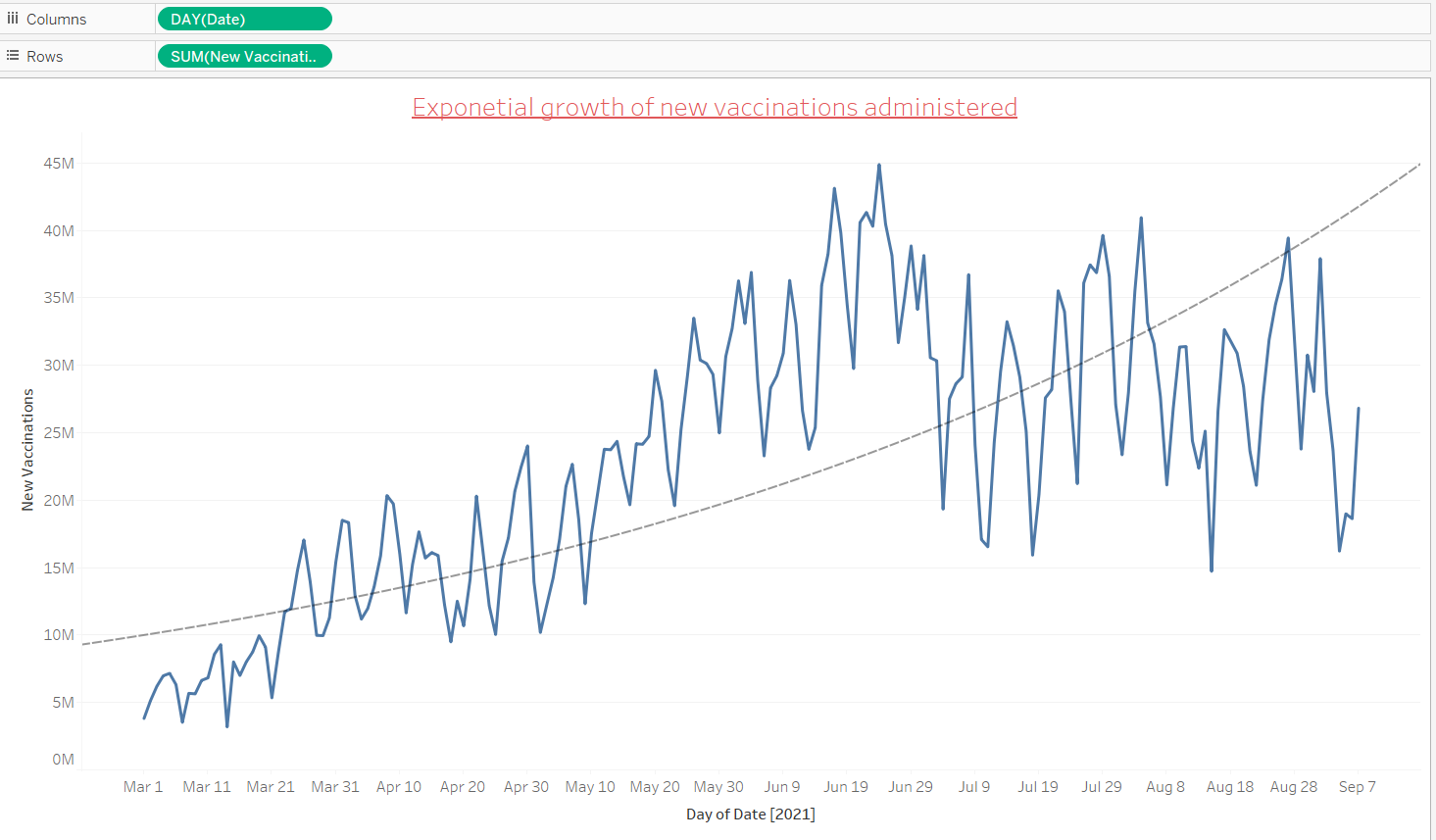
Graph showing exponential increase in new vaccinations administered all over the world
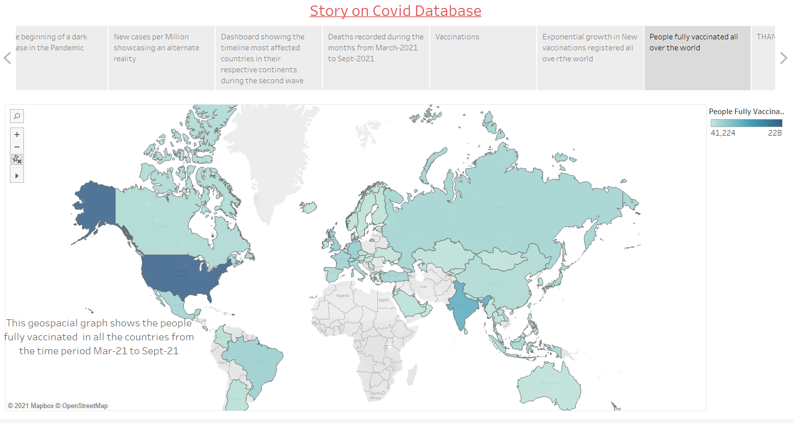
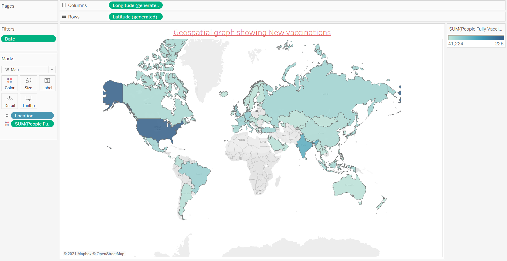
Geospacial graph showing people fully vaccinated. Even now millions of vaccine doses are being administered on a daily basis thorughtout the world .
Graphs that we used for our story
Dashboard that we used in our story
THANK YOU
Contributors
Shreya Khetan- 16010120023
Gaurav Chawla- 16010120007
Acknowledgement
We would like to thank Prof. Vaibhav Vasani for the guidance and support throughout the coursework.