A simple react component to render a paginated list ✨powered by styled-components 💅
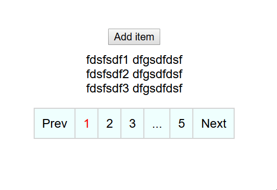
npm install react-paginated-listyarn install react-paginated-list- Pass in the list items that contain your data in the list prop
- In the renderList prop, pass in the function to render out the list.
let users = [{'a': 123, 'b': 345}, {'c': 678, 'd': 891}];
return (
<PaginatedList
    list={users}
    itemsPerPage={3}
    renderList={(list) => (
      <>
        {list.map((item, id) => {
          return (
            <div key={id}>
              {item.a} {item.b}
            </div>
          );
        })}
      </>
    )}
/>);To run the example project,
- Clone the repo
git clone https://github.com/rigelglen/react-paginated-list- Install deps
npm run install-all- Run example project
npm run dev* indicates a required prop
| Prop | Description | Type | Default |
|---|---|---|---|
| list* | This is the list of items managed by the component. This list will be available in the renderList method to render your list |
Array | - |
| renderList* | This is the function that renders each of your list items. | (list: Array) => JSX.Element | - |
| itemsPerPage | Number of items per page | number | 10 |
| onPageChange | Callback function that is called when the page is changed | (items: Array, currentPage: number) => void | - |
| isLoading | Sets whether the list is loading or not. | boolean | false |
| ControlItem | Styled Component for the pagination item | AnyStyledComponent | styled.li` |
| ControlContainer | Styled Component for the pagination controls | AnyStyledComponent | styled.div`` |
| PaginatedListContainer | Styled Component for the entire paginated list (contains the actual list and pagination controls) | AnyStyledComponent | styled.div`` |
| loadingItem | Component to be displayed when list is loading | JSX.Element | <p>Loading...</p> |
| breakText | Text to be shown for ellipsis | string | '...' |
| displayRange | The range of pages displayed | number | 3 |
| leftMargin | Number of extra pagination items to display on the left | number | 1 |
| rightMargin | Number of extra pagination items to display on the right | number | 1 |
| currentPage | Sets the initial page | number | 1 |
| controlClass | Class of the pagination box | string | 'pagination' |
| activeControlClass | Class of the active pagination item | string | 'active' |
| displayNumbers | Display pagination numbers | boolean | true |
| loopAround | Loop around after the end | boolean | false |
| breakClass | Class for the break item | string | 'pagination-break' |
| nextClass | Class of the next button | string | next |
| prevClass | Class of the prev button | string | prev |
| paginatedListContainerClass | Class of the entire paginated list (contains the actual list and pagination controls) | string | - |
| controlItemClass | Class of every pagination control item | string | pagination-item |
| showPrev | Show previous pagination control (does nothing if useMinimalControls is true) | boolean | true |
| showNext | Show next pagination control (does nothing if useMinimalControls is true) | boolean | true |
| nextText | Text inside next button | string | '〉' |
| prevText | Text inside prev button | string | '〈' |
| useMinimalControls | Hides next or previous button if there is no next or previous page respectively. | boolean | false |
Released under the MIT license. MIT: http://rem.mit-license.org, See LICENSE