In this project, after extracting the data sets as csv, we tried to represent the car prices graphically and schematically by using data analysis and data visualization methods. We checked the connection of the car prices we analyzed with other data, then we created a 4-layer and 12-neuron system.
import pandas as pd
import numpy as np
import matplotlib.pyplot as plt
import seaborn as sbndataFrame=pd.read_excel("merc.xlsx")
dataFrame.head()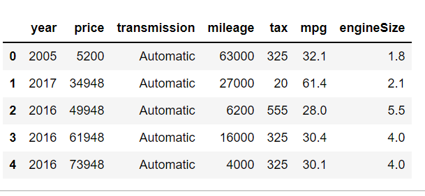
dataFrame.describe()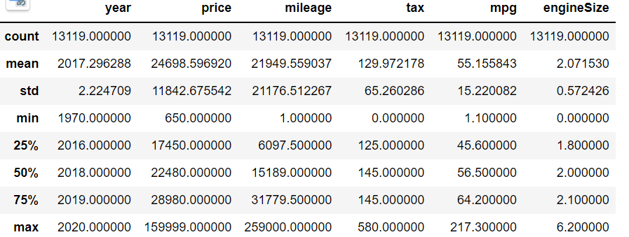
plt.figure(figsize=(7,5))
sbn.displot(dataFrame["price"])
sbn.countplot(dataFrame["year"])
sbn.scatterplot(x="mileage",y="price",data=dataFrame)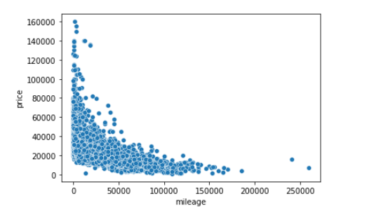
sbn.scatterplot(x="year",y="price",data=dataFrame)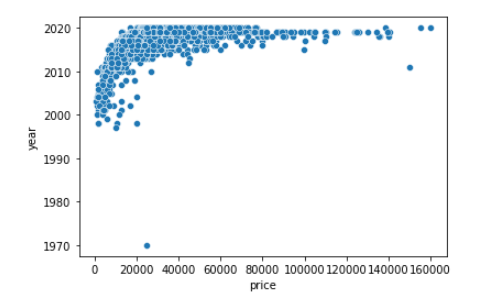
Veritemizleme=dataFrame.sort_values("price",ascending=False).iloc[131:]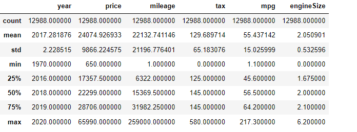
from sklearn.preprocessing import MinMaxScaler
scaler=MinMaxScaler()
x_train=scaler.fit_transform(x_train)
x_test=scaler.transform(x_test)

from tensorflow.keras.models import Sequential
from tensorflow.keras.layers import Dense

model=Sequential()
model.add(Dense(12,activation="relu"))
model.add(Dense(12,activation="relu"))
model.add(Dense(12,activation="relu"))
model.add(Dense(12,activation="relu"))
model.add(Dense(1))
model.compile(optimizer="adam",loss="mse")
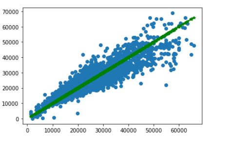
model.fit(x=x_train,y=y_train,validation_data=(x_test,y_test),batch_size=250,epochs=300)plt.scatter(x=y_test,y=tahminDizisi)
plt.plot(y_test,y_test,"g-*")