Flutter Basics
import 'package:flutter/material.dart';

void main(){
  var app = MaterialApp(
    home: Text('Salam')
  );

  runApp(app);
}
The first thing to do is to import a Library from Flutter to get content on screen.
import 'package:flutter/material.dart'; Flutter widgets implementing Material Design.
void main(){...} a function that run when our app starts.
home: This is the route that is displayed first when the application is started normally.
- Text: widget displays a string of text with single style.
MaterialApp: A convenience widget that wraps a number of widgets that are commonly required for material design applications.
runApp(<Widget_app>) Inflate the given widget and attach it to the screen.
Oversimplified exemple
The core of Flutter’s layout mechanism is widgets. In Flutter, almost everything is a widget—even layout models are widgets. The images, icons, and text that you see in a Flutter app are all widgets. But things you don’t see are also widgets, such as the rows, columns, and grids that arrange, constrain, and align the visible widgets.

More on Layouts in Flutter.
More on Layout widgets.
MaterialApp(
  home: Scaffold(
  appBar: AppBar(
    title: Text("Title"),
    backgroundColor: Colors.blueGrey[400],
    actions: <Widget>[
      IconButton(
        icon: Icon(Icons.add),
        onPressed: () {},
      ),
      IconButton(
        icon: Icon(Icons.remove),
        onPressed: () {},
      ),
    ],
  ),
  bottomNavigationBar: BottomNavigationBar(
    items: [
      BottomNavigationBarItem(
        icon: Icon(Icons.cloud_off),
        title: Text("Disable"),
      ),
      BottomNavigationBarItem(
        icon: Icon(Icons.cloud),
        title: Text("Enable"),
      ),
    ],
    onTap: (int i) => print('page $i taped'),
    fixedColor: Colors.red,
    // if you have more icons that couldn't fit
    type: BottomNavigationBarType.fixed,
  ),
  floatingActionButton: FloatingActionButton(
    //child: Text('+'),
    child: Icon(Icons.add),
    onPressed: () {
      print("cliked me");
    },
  ),
  body: Text('body'),
));Scaffold: Implements the basic material design visual layout structure.
-
AppBar: which is a horizontal bar typically shown at the top of an app using the
appBarproperty.
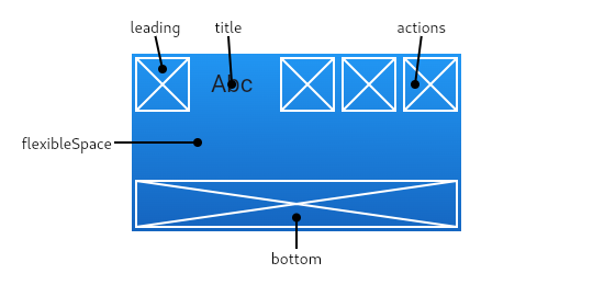
-
body: The primary content of the scaffold.
-
FloatingActionButton: which is a circular button typically shown in the bottom right corner of the app using the
floatingActionButtonproperty. -
- child: The widget below this widget in the tree.
-
-
-
Icon: Creates an icon,
Icons.<material_icons(1)>
-
Icon: Creates an icon,
-
-
- onPressed: called when the button is tapped.
// from network
Image.network(URL)

// short way
Image.asset('images/dice1.png')

// more controlle
Image(
  width: 200,
  image: AssetImage('images/dice1.png'),
)On the custom Widget:
import 'package:flutter/material.dart';

class <Widget_Name> extends StatelessWidget{
  Widget build(context){
    return MaterialApp(...);
  }
}
The custome widget must be imported in order to be used.
On The Main:
import 'package:flutter/material.dart';
import '<path_to_Widget>/<Widget_File>.dart';

void main(){
  runApp(<Widget_Name>());
}Scaffold.of(context).showSnackBar(new SnackBar(
content: new Text("Sending Message"),
));Basic TextField:
TextField(
  autocorrect: true,
  autofocus: true,
  decoration: InputDecoration(
    icon: Icon(Icons.perm_identity),
    hintText: 'User name',
    labelText: 'Your name'
  ),
);
Widget Field(){
return TextFormField(
keyboardType: TextInputType.emailAddress,
//obscureText: true,
decoration: InputDecoration(
labelText: 'Email Adress',
hintText: 'you@company.com',
),
);
}TextFormField A FormField that contains a TextField.
-
InputDecorationThe border, labels, icons, and styles used to decorate a Material Design text field, using the decoration property. -
-
labelTextText that describes the input field.
-
-
-
hintTextText that suggests what sort of input the field accepts.
-
-
-
errorTextText that appears below the input child and the border.
-
-
TextInputType.<KeybordType>The type of information for which to optimize the text input control, using the keyboardType property. -
obscureText: <boolean>if true it will show DOT for password usage, by default flase.
Widget submitField(){
  return RaisedButton(
    child: Text('Login'),
    onPressed: (){},
  );
}
RaisedButton A material design "raised button".
To perform a Form validation we need a key that store the submite data, final <keyName> = GlobalKey<FormState>();.
GlobalKey A key that is unique across the entire app.
FormState A FormState object can be used to save, reset, and validate every FormField that is a descendant of the associated Form.
To store a Form data into a varibale:
onSaved: (value){
  <var> = value;
},
To validate a Form data:
validator: (value) {
    if (<valid_cond>)
      return <not_isValidated>;
    return <isValidated>; //usualy null
}
To call them you can use the onPressed property:
onPressed: () {
  if (<keyName>.currentState.validate())
      <keyName>.currentState.save();
    <keyName>.currentState.reset();
},
currentState The State for the widget in the tree that currently has this global key.
Checkout this, exemple 1, exemple 2.
To send a get reqest:
void func() async{
    var res = await get('<url>');
    var data = json.decode(res.body);
}
get Sends an HTTP GET request with the given headers to the given URL.
json.decode Converts data in JSON format into a data object.
If you want to specify a model for the parsed Json:
class <Model> {
  <type> <var_name>;

  //Ctor

  Model.fromJson(Map<String, dynamic> parsedJson){
    <var_name> = parsedJson['<API_Key_Name>'];
  }
}ListView(
children: <Widget>[
TaskItem('task#1'),
TaskItem('task#2'),
TaskItem('task#3'),
],
)Widget build(context) {
return ListView.builder(
itemCount: <num_of_item>,
itemBuilder: (context, index){
return <Widget>[index];
}
);
}ListView.builder Creates a scrollable, linear array of widgets that are created on demand.
- The
itemCountcallback will be called only with indices greater than or equal to zero and less than itemCount. - The
itemBuildershould actually create the widget instances when called.
For better desing use the ListeTile as a child, a line separator can be added by changing ListView.builder to ListView.separated and adding separatorBuilder: (BuildContext context, int index)=>Divider(),.
class CustomList extends StatelessWidget {
  final names = ["Alpha", "Beta", "Gamma"];

  @override
  Widget build(BuildContext context) {
    return Container(
      child: ListView.builder(
        itemCount: names.length,
        itemBuilder: (BuildContext context, int index) {
          return ListTile(
            leading: CircleAvatar(
              child: Text(names[index].substring(0,1)),
            ),
            title: Text(names[index]),
            subtitle: Text("More Details"),
            trailing: CircleAvatar(
              child: Icon(Icons.remove_circle),
            ),
          );
        },
      ),
    );
  }
}
note: if the listview was in Row/Column widget wrap it using Expanded().
Container A convenience widget that combines common painting, positioning, and sizing widgets.
-
decorationThe decoration to paint behind the child. -
-
BoxDecorationThe BoxDecoration class provides a variety of ways to draw a box.
-
-
-
marginEmpty space to surround the decoration and child.
-
-
-
paddingEmpty space to inscribe inside the decoration. The child, if any, is placed inside this padding.
-
Checkout the exemple.
let's set a widget for testing purpose.
class CTest1 extends StatelessWidget {
  @override
  Widget build(BuildContext context) {
    return Column(
      children: <Widget>[
        Text("Block 1 "),
        Text("Block 2 "),
        Text("Block 3 "),
      ],
    );
  }
}
In body we have a Container that has a Column let's start.
If we want to represent our widget like this:
X
X
    X
    X
        X
        X
Since a widget is above other widget the keep in mind that the main parrent has a Column widget.
Align(
  alignment: Alignment.centerLeft,
  child: Column(
    children: <Widget>[
       CTest1(),
      CTest1(),
    ],
  ),
),
Align(
  alignment: Alignment.center,
  child: Column(
    children: <Widget>[
      CTest1(),
      CTest1(),
    ],
  ),
),
Align(
  alignment: Alignment.centerRight,
  child: Column(
    children: <Widget>[
      CTest1(),
      CTest1(),
    ],
  ),
),
If we want to represent our widget like this:
XX
    XX
        XX
Since a widget is above other widget the keep in mind that the main parrent has a Row widget.
Row(
  mainAxisAlignment: MainAxisAlignment.start,
  children: <Widget>[
    CTest1(),
    CTest1(),
  ],
),
Row(
  mainAxisAlignment: MainAxisAlignment.center,
  children: <Widget>[
    CTest1(),
    CTest1(),
  ],
),
Row(
  mainAxisAlignment: MainAxisAlignment.end,
  children: <Widget>[
    CTest1(),
    CTest1(),
  ],
),- The
mainAxisAlignmentin aColumnwill set your widget up or down (Y axe), while in aRowit will set them left or right (X axe). - The
crossAxisAlignmentin aColumnwill set your widget left or right (X axe), while in aRowit will set them up or down (Y axe).
new GestureDetector(
  child:  Text('Body Text'),
  onDoubleTap: ()=>print('double tap'),
  onTap: ()=>print('single tap'),
  onLongPress: ()=>print('long tap'),
)// Straight forward way
Navigator.push(context, MaterialPageRoute(builder: (context) {
return Screen2();
}));
Navigator.pop(context);
// Using routes
return MaterialApp(
initialRoute: '/',
routes: {
'/': (context) => Screen0(),
'/first': (context) => Screen1(),
'/second': (context) => Screen2(),
},
);
Navigator.pushNamed(context, '/first');Flutter Documentation && Material Compenents
Material (1)icons