Timeline Card for Home Assistant
Real-time event history with WebSocket updates & beautiful timeline UI
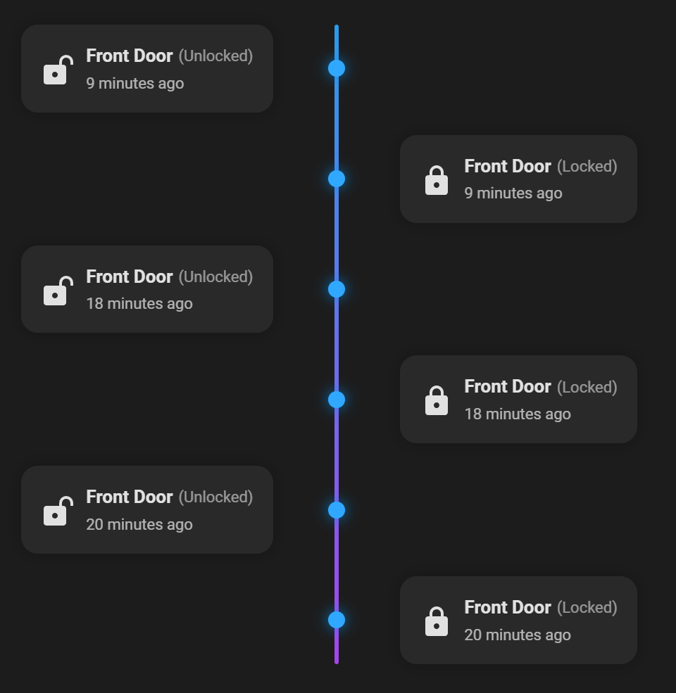
- Alternating center layout plus optional left/right single-sided modes
- Configurable history range (in hours)
- Global limit for the number of events shown
- Overflow handling: collapse extra entries or use a scrollable container
- Per-entity configuration (name, icons, colors, status labels, filters)
- Fully configurable via the Home Assistant UI editor
- Compact layout option to reduce vertical space
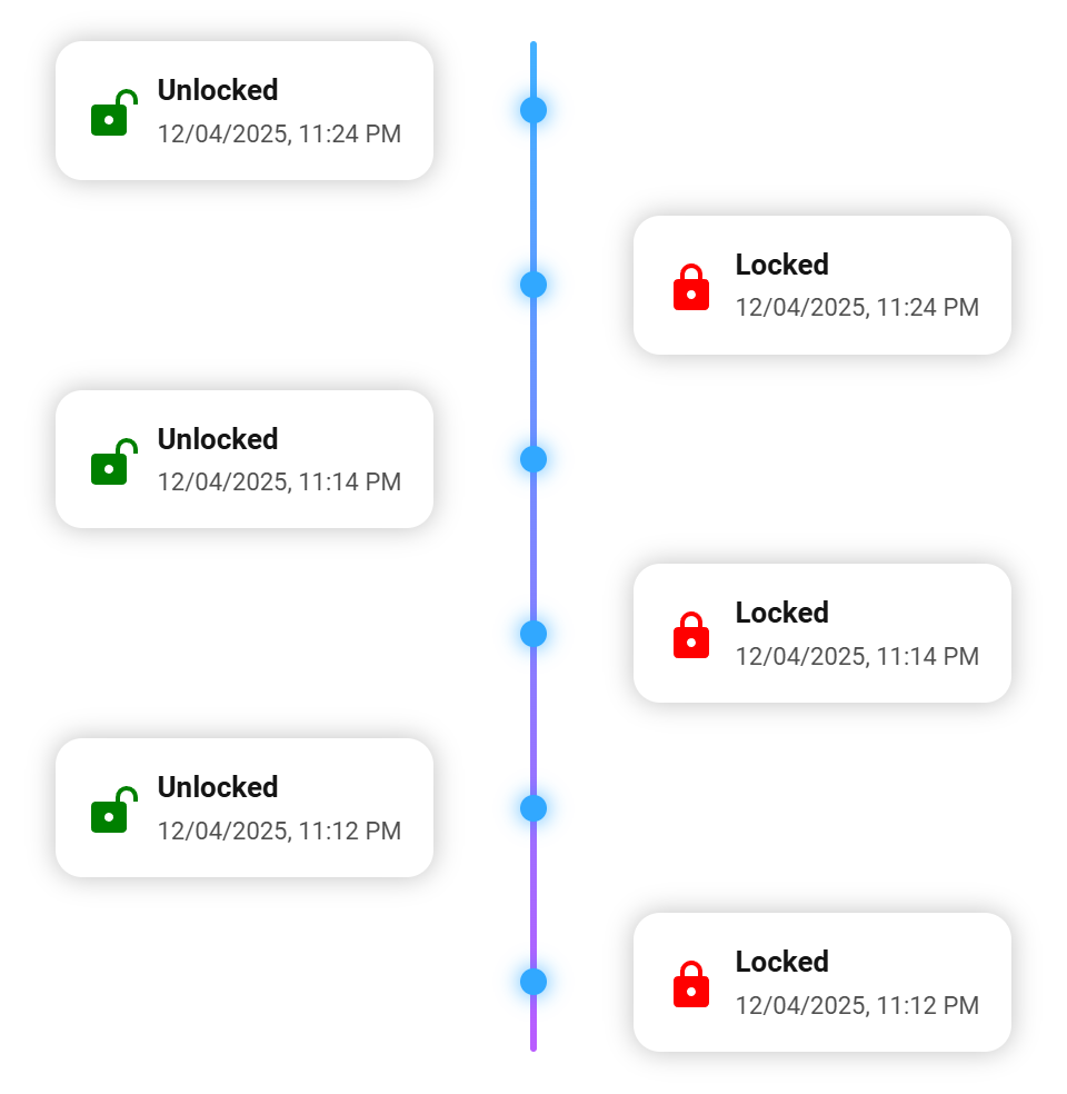
- Localized relative time (e.g. "5 minutes ago") or absolute datetime
- Locale-based state translation with per-entity overrides
- Optional auto-refresh interval (in seconds)
- Live updates via WebSocket - timeline updates instantly without page refresh
- Works with any entity that appears in Home Assistant history
click to show installation instructions
The Repository is part of the official HACS store.
To install it, click this link:

Or:
Open the HACS panel in HA, search for timeline-card, and click download.
Follow the instructions provided to complete the installation.
click to show installation instructions
- Download
timeline-card.jsfrom the latest GitHub release. - Place the file in your Home Assistant
wwwdirectory:
/config/www/timeline-card/timeline-card.js
- Add the resource to your dashboard configuration:
resources:
  - url: /local/timeline-card/timeline-card.js
    type: module
Or via the UI: Settings > Dashboards > ... > Resources > Add resource
type: custom:timeline-card
title: Door & Presence
hours: 12
limit: 8
relative_time: true
show_states: true
allow_multiline: true
entities:
  - entity: binary_sensor.frontdoor_contact
- entity: person.tobi| Option | Type | Required | Default | Description |
|---|---|---|---|---|
entities |
list | yes | - | List of entities or entity config objects |
hours |
number | yes | - | Number of hours of history to fetch |
limit |
number | yes | - | Max number of events displayed |
visible_events |
number | no | - | Only show the first N events; hide the rest behind a toggle |
overflow |
string | no | collapse | collapse (Show more/less) or scroll (scrollable container) |
max_height |
string | no | - | Constrain card height (e.g. 220px, 16rem); useful with overflow: scroll |
title |
string | no | "" | Card title |
relative_time |
boolean | no | false | Use relative ("5 minutes ago") time |
show_date |
boolean | no | true | Include the date in absolute timestamps; set false to show time only |
show_names |
boolean | no | true | Show entity names |
show_states |
boolean | no | true | Show entity states |
show_icons |
boolean | no | true | Show entity icons |
language |
string | no | auto | Language code (default en-US; supports en-US, en-GB, de, fr, pt-BR, etc.) |
refresh_interval |
number | no | - | Auto-refresh interval in seconds (background refresh) |
allow_multiline |
boolean | no | false | Enables automatic multiline wrapping for long names/states |
force_multiline |
boolean | no | false | Always place the state on a new line below the name |
card_layout |
string | no | center | Layout mode: center (alternating), left (timeline left, cards right), right (timeline right, cards left) |
compact_layout |
boolean | no | false | Overlaps alternating rows to reduce vertical height (only with card_layout: center) |
card_background |
string | no | - | Card background color (supports hex/rgb/rgba) |
name_color |
string | no | - | Global name color (overridden by entity) |
state_color |
string | no | - | Global state color (overridden by entity) |
timeline_color_start |
string | no | - | Timeline gradient start color (hex/rgb/rgba) |
timeline_color_end |
string | no | - | Timeline gradient end color (hex/rgb/rgba) |
dot_color |
string | no | - | Timeline dot color (hex/rgb/rgba) |
collapse_duplicates |
boolean | no | false | Removes consecutive events with the same state across all entities. |
type: custom:timeline-card
relative_time: false
show_date: false
entities:
- entity: light.living_roomUse visible_events when you want to fetch more history than you can show in the available space. With the default overflow: collapse, extra entries are hidden behind a Show more/less toggle. If you prefer a scroll container, set overflow: scroll and add a max_height.
type: custom:timeline-card
hours: 12
limit: 10            # total items fetched
visible_events: 3    # initially shown
overflow: collapse   # or "scroll"
# max_height: 220px  # recommended when using overflow: scroll
entities:
  - entity: binary_sensor.frontdoor_contact
- entity: person.tobiYou can enable an optional background refresh interval.
The card will periodically re-fetch history data without reloading the UI.
type: custom:timeline-card
hours: 6
limit: 8
refresh_interval: 30   # refresh every 30 seconds
entities:
  - entity: sensor.energy_usage
The refresh runs silently in the background and only updates the timeline if new events appear.
The card listens to Home Assistant state_changed events via WebSockets.
Any change of the configured entities is added to the timeline immediately - without refreshing the page.
No configuration is required.
Live updates work automatically as soon as the card is loaded.
Features:
- Real-time updates for all configured entities
- Same formatting as history events (icons, colors, labels, localization)
- No full dashboard reload - only the timeline content is updated
entities:
  - entity: binary_sensor.frontdoor_contact
    name: Front Door
    icon: mdi:door
    icon_color: "#ffcc00"
    state_color: "#00aaff"
    name_color: "#ffaa00"
    icon_color_map:
      on: "#ff4444"
      off: "#44ff44"
    icon_map:
      on: mdi:door-open
      off: mdi:door-closed
      default: mdi:door
    state_map:
      on: "opened"
      off: "closed"
    include_states:
      - on
- off| Option | Type | Description |
|---|---|---|
name |
string | Display name override |
icon |
string | Static icon |
icon_map |
object | State -> icon mapping |
icon_color |
string | Static icon color |
icon_color_map |
object | State -> color mapping |
state_map |
object | State -> label override |
include_states |
list | Only include events with these raw states |
exclude_states |
list | Hide events with these raw states (alternative to include_states) |
show_entity_picture |
boolean | Show the entity picture instead of the icon when available |
name_color |
string | Name color override (fallback: card -> theme) |
state_color |
string | State color override (fallback: card -> theme) |
collapse_duplicates |
boolean | Removes consecutive events with the same state for this entity only (overrides global setting). |
type: custom:timeline-card
title: Presence Timeline
hours: 24
limit: 10
relative_time: true
entities:
  - entity: person.tobi
    icon_map:
      home: mdi:home
      not_home: mdi:account-arrow-right
    state_map:
      home: "at home"
not_home: "away"type: custom:timeline-card
title: Doors & Windows
hours: 6
limit: 12
show_states: true
entities:
- entity: binary_sensor.frontdoor_contact
- entity: binary_sensor.window_livingroomYou can use hass-browser_mod (v2) to open the Timeline Card in a popup instead of the default more-info dialog.
This is useful if you want a quick visual history on tap while keeping the standard more-info dialog available via hold or double-tap.
Click to expand YAML example
- entity: binary_sensor.door_window_sensor_entrance_contact
  icon: mdi:door-open
  name: Main door
  tap_action:
    action: fire-dom-event
    browser_mod:
      service: browser_mod.popup
      data:
        content:
          type: custom:timeline-card
          title: Main door
          hours: 24
          limit: 12
          show_states: true
          show_names: false
          allow_multiline: true
          entities:
            - entity: binary_sensor.door_window_sensor_entrance_contact
              icon_color_map:
                "on": "#F08080"
                "off": "#77DD77"
              icon_map:
                "on": mdi:door-open
                "off": mdi:door-closed
              state_map:
                "on": opened
                "off": closed
              include_states:
                - "on"
                - "off"
              collapse_duplicates: true
  hold_action:
    action: more-info
  double_tap_action:
action: more-infoThe card uses JSON-based localization.
Available translations:
- English
- German
- French
- Brazilian Portuguese
- Swedish
MIT License
Free to use, free to modify.