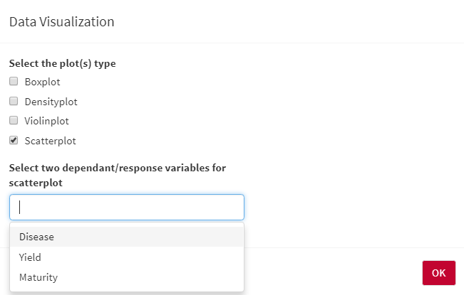
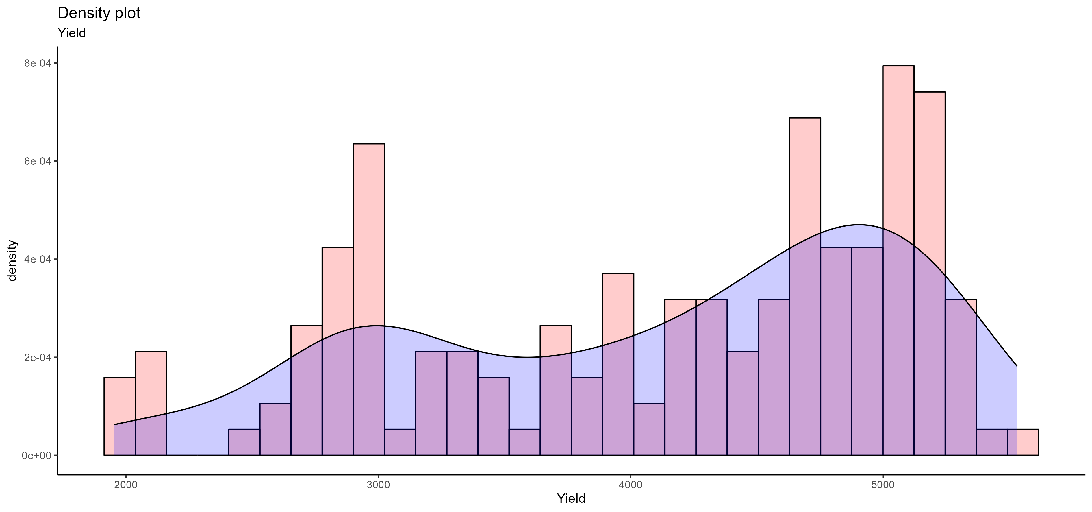
Data Visualization
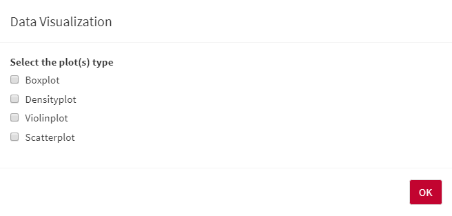
AllInOne has the ability to visualize your data using different options such as box, violin, density, and scatter plots. You need to select Data Visualization from Pre-Processing Steps bar and then choose the visualization methods you would like to have:
- You can also select multiple visualization methods at the same time:
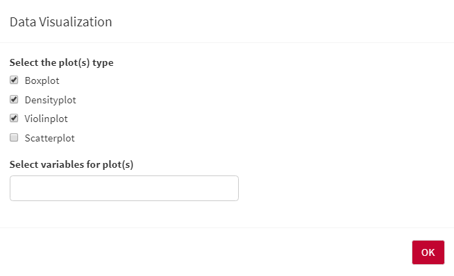
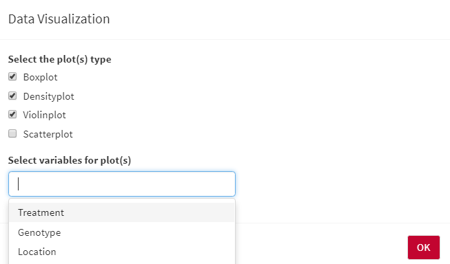
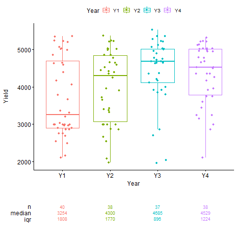
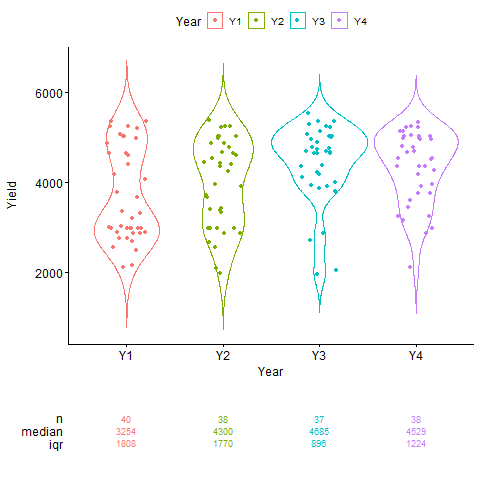
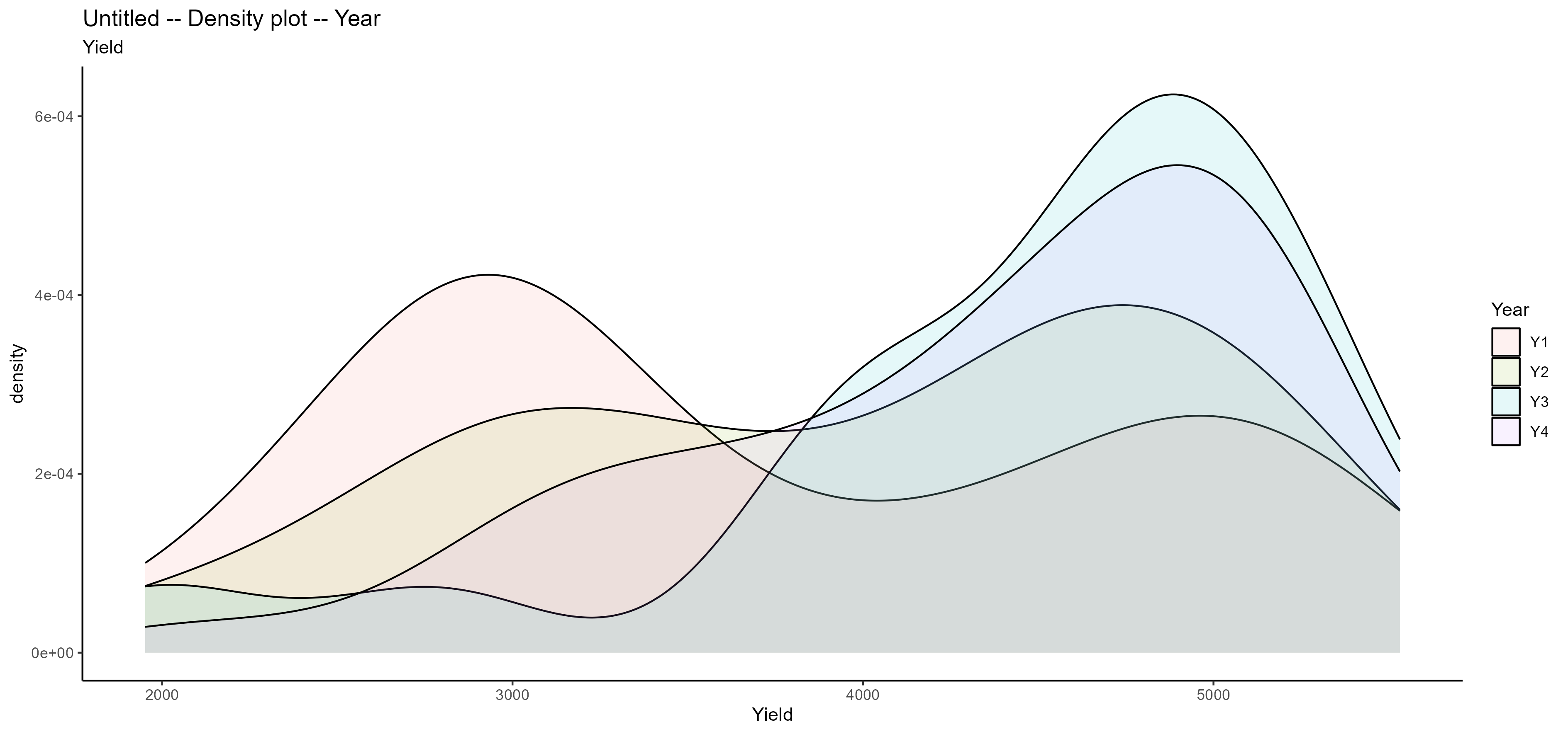
- For box, violin, and density plots, you need to select the independent variable(s) that would like to see on the X-axis of the plots. the Y axis would be the dependent/response variable:
- For the scatter plot, you need to select two dependent/response variables, the first one will show on the X-axis, and the second one will show on the Y-axis:
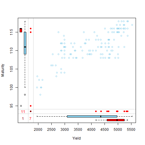
The blue box plots are based on the observed data. the red numbers are the number of missing data and the dark red is the number of the common missing row in both selected dependent/response variables (more information):