Missing Data Handler
AllInOne has the ability to check the missing pattern in your dataset and impute the missing data using various imputation methods.
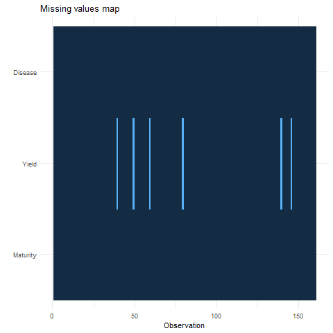
The graph on the upper side has the observation number on X-axis and all dependent/response variables on Y-Axis.
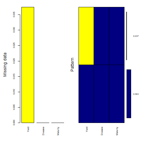
The graph on the lower side has all dependant/response variables on the X-axis and the percentage of missing data on the Y-axis. the Dark blue shows the percentage of existing data and the yellow shows the percentage of missing data points in the dataset.
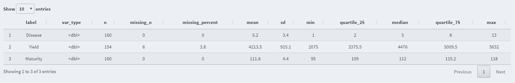
- Label: Variable name
- n: Number of available/existing data points
- missing_n: Number of missing data points
- missing_percent: Percentage of missing data points over the total n
- mean: Mean of the variable
- sd: Standard deviation of the variable
- min: Minimum value in the variable
- quartile_25: Bottom Quartile
- median: Median of the variable
- quartile_75: Third quartile
- max: Maximum value in the variable
AllInOne uses the power of the mice package to impute the missing data points using the following imputation methods:
- Remove Missing Point method simply removes all the missing data points.
- Predictive Mean Matching (PMM) is a technique of imputation that estimates the likely values of missing data by matching to the observed values/data (More...).
- Weighted predictive mean matching can impute missing data by predictive mean matching or normal linear regression using sampling weights (More...).
- Random sample from observed values consists of taking random observations from the pool of available data and using them to replace the NA. (More...).
- Classification and regression trees (CART) models seek predictors and cut points in the predictors that are used to split the sample. The cut points divide the sample into more homogeneous subsamples which would be more useful in predicting the missing data points (More...).
- Random forest imputations have the desirable properties of being able to handle mixed types of missing data, they are adaptive to interactions and nonlinearity, and have the potential to scale to big data settings (More...).
- Unconditional mean imputation basically takes the mean of the observed data and imputes any missing values with it (More...).
- Bayesian linear regression Calculates imputations for univariate missing data by Bayesian linear regression, also known as the normal model (More...).
- Linear regression ignoring model error is useful for large datasets where sampling variance is not an issue. It could be useful to select this method, which does not draw regression parameters and is thus simpler and faster (More...).
- Linear regression using bootstrap imputes univariate missing data using linear regression with bootstrap (More...).
- Linear regression predicted values imputes the "best value" according to the linear regression model, also known as regression imputation (More...).
- Lasso linear regression imputes univariate missing data using Bayesian linear regression following a preprocessing lasso variable selection step. (More...).
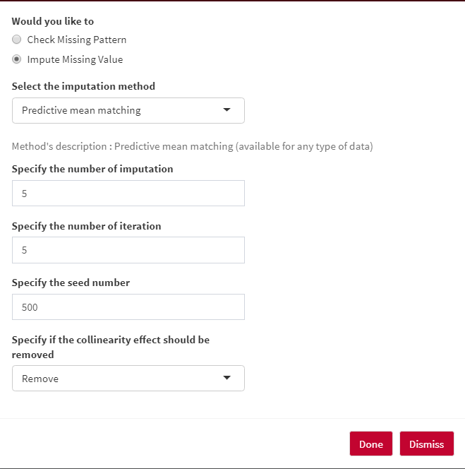
The number of iterations in each imputation can be specified under Specify the number of iteration option.
In order to get the same results every time, you can set a seed number under Specify the seed number option.
You can let methods to remove/ not remove any collinearity effects among your response/dependent variables.
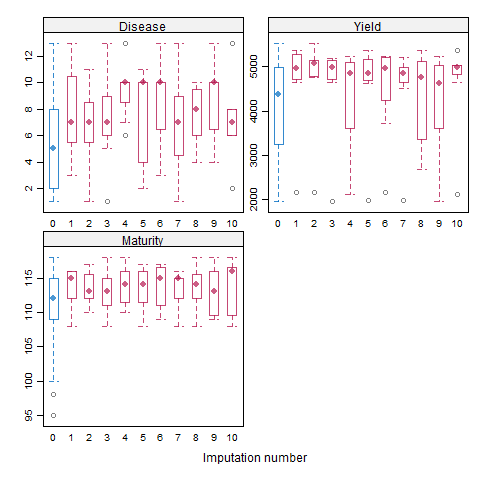
In a box and whisker plot: The left and right sides of the box are the lower and upper quartiles. The box covers the interquartile interval, where 50% of the data is found. Here, the blue box plot shows the observed data, and the red plot showes the imputation distribution of the predicted data points. The X-axis is the number of imputations and Y-axis is the response/dependent variable.
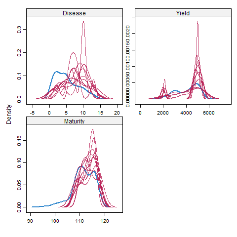
Here, the blue plot shows the observed data, and the red plot shows the density of the predicted data points. The X-axis is the number of imputations and Y-axis is the response/dependent variable. the X-axis is the response/dependent variable and the y-axis shows the probability density function for the kernel density estimation.
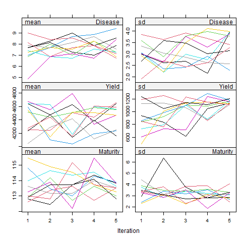
Here, plots on the left side are the mean, and the right plots are the standard deviation (SD) of the response/dependent variables. Each color represents the number of imputations, and Y-axis is the response/dependent variable. Basically, the mean of the predicted data points, along with its SD value, can be seen in each imputation set.
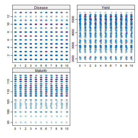
Here, the X-axis is the number of imputations, and Y-axis is the response/dependent variable. the blue dots show the observed data, and the red dots show the predicted data points.